Scatter and Density Plots
Hello everyone, I am trying to visualize power plant dataset and I would like some feedback.
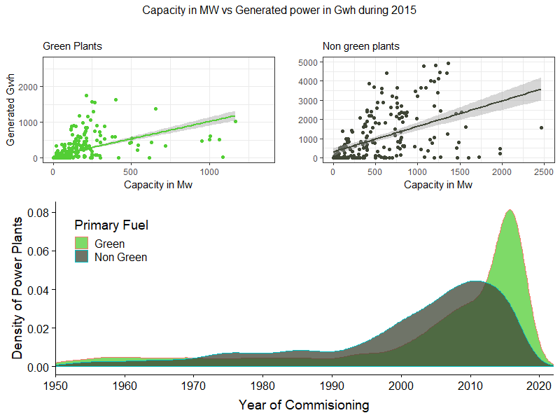
First and foremost, the visualization was created with ggplot2 in R. I separated the primary fuels of each power plant into “Green” and “Non Green” in order to do a binary classification and I kept only years after 1950 as the others contained excessive noise within. The top two scatter plots shows the correlation of Estimated Generated power regarding to Capacity in Mw of each power plant in a scatter plot and I attached a linear model with each respective confidence intervals (95%). The bottom density graph shows the distribution of the two type of sources among years (1950 - 2020).
Source of dataset: Global Power Plant Database - Datasets - WRI ODP
Thus, my main questions are:
- Do you think this visualization is efficient?
- I found statistical significance over the models, should I include the p-values and slope as well?
- Does the colour correspond to the “Green” - “Non Green” classification? or is it irrelevant?
Any other comments are very welcomed.
Thanks in advance,
Thomas