Hello there, I’m a student from Swansea University looking to get feedback for my visualisation I have created for a coursework.
Image:
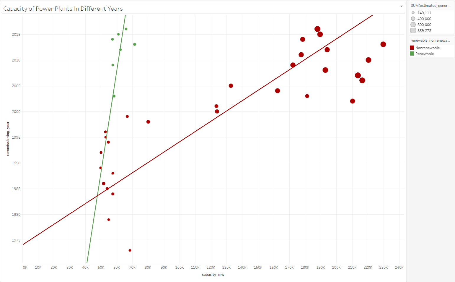
Visual Design Type: Scatter plot.
Name of Tool: Tableau.
Country: Global.
Year: 1972 - 2017.
Visual Mappings: SUM(capacity_mw) in the x axis and commissioning_year in the y axis. SUM(estimated_generation_gwh) represents the size of each plot and colour is used to show renewable/nonrenewable energy output.
Unique Observation: The scatter gives a visual depiction of how both power capacity and estimated power output in power plants is directly correlated to the years going by. We can also see that the commissioning of renewable power sources started to increase from 2003 onward however power output is not as big as conventional nonrenewable fuel sources.
Data Preparation: Aggregating fuel types into either renewable or nonrenewable. Ignoring of NULL values in the commission_year dimension.
Dataset: Global Power Plant Database - Datasets - WRI ODP
Question:
I feel like including the estimated power generation (size) is somewhat redundant because of its similarity to the capacity dimension. Is there a way to contrast the two dimensions in order to pick up on minute differences?
Would there be a more suitable visualisation technique for this data?
Many thanks.