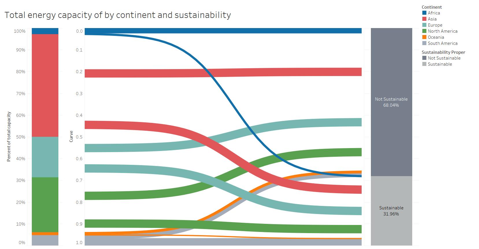
Hi all, another Swansea student looking for some advice re a visualisation. I’ve attached an image below and any insight on the appropriateness would be appreciated.

Description
Visual Design Type: Sankey diagram
Name of Tool: Tableau
Country: World broken down to continents
Year: All years of the dataset
Visual Mappings:
: * colour : colour mapped different continents and greyscale used for primary fuel categories
: * size : size of the curve relates to the capacity of a specific fuel type
Unique Observation:
There is a greater concentration of the capacity of the fuel in Asia and North America compared to South America or Africa
Data Preparation:
Aggregating the data to continents and removing superfluous information
Source : Global Power Plant Database - Datasets - WRI ODP
Questions:
It is possible to extract meaning from the visualisation?
I’m concerned about the number of curves in the graphic and wanted to know whether I should try to further aggregate the fuel types?
Would a different type of visualisation be more appropriate for what I’m trying to convey?
I haven’t thought too much about the colours for the continents, and wanted to know whether these are acceptable or what I should be looking for when categorising things by colour.
Thanks!
Lorcan