In some cases this list is much longer. I know about simple tabular representation, illustrative diagrams. With long list tabular might not be a good representative. What other solutions can one use?
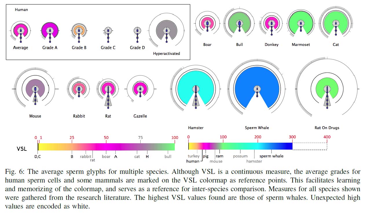
This depends on the tasks that your visualization is intended to support. There is a common myth that visualization is for retrieving data values. In fact, in most cases, visualization provides poor support to accurate data retrieval (e.g., [1]). I guess that the tasks that you may wish to support may include (a) comparison between different species, (b) comparison between different instances within a species, or (c ) overview of many instances as part of a process of overview first and details on demand. For (a), the variations are expected to be large, and you may consider the approach by Duffy et al. [2]. For (b) and (c ), it is better to create a set of reference values (e.g., the mean values for a species), and you may consider to encode the values of an instance by juxtaposing them with (or relative to) the reference values. This allows viewers to notice the offsets quickly, or to compare different instances in terms of their offsets against the reference values.
[1] R. Kanjanabose, et al. A multi-task comparative study on scatter plots and parallel coordinates plots, Computer Graphics Forum, Wiley, 34(3):261-270, 2015.
[2] B. Duffy, et al. Glyph-based video visualization for semen analysis, IEEE Transactions on Visualization and Computer Graphics, 21(8):980-993, 2015.