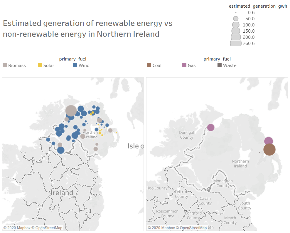
Unique Observation: Northern Ireland has a large number of renewable energy sources, with large amounts of energy being generated from wind farms, biomass and solar.
Data Preparation: Filtered out all countries apart from the United Kingdom and filtered into renewable and non-renewable energy.
Does the visualisation represent the data well?
The visualisation shows an easy way to see the difference in fuel sources. However, both maps could benefit from having the same level of zoom so the circle diameter for each fuel type size is comparative.
Possibly use slight transparency to gain insight on other types of fuel that might be hidden below a larger fuel type circle.
A more detailed way to see data size apart from circle diameter could be useful, possibly in the form of a bar chart under each map image.
I have aimed to try and represent the fuels with colours that I believe represent the type of data, are these sensible choices?
Fuel colour for solar and wind are great.
I would relate the following colours to each fuel type personally (these would need to be check against a colourblind palette also for accessibility:
coal = black / anthracite,
gas = orange,
biomass = green,
Waste = brown.