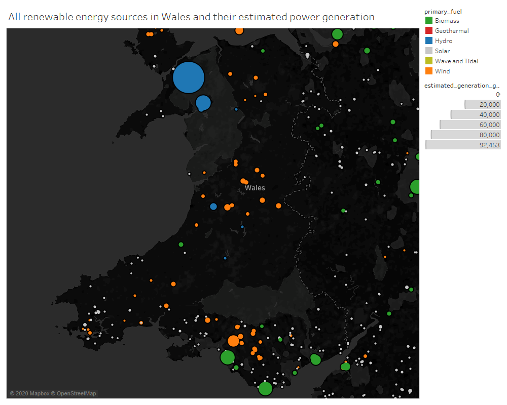
Visual Design Type: Symbol Maps
Name of Tool: Tableau
Country: United Kingdom
Year: All available dates
Visual Mappings:
- Colour – Primary Fuel
- Shape – Circle
- Size – Estimated Generation GWH
Unique Observation: Overall Wales has a lot of established renewable power sources, mainly lots of small solar/wind farms. A large Hydro is located to the north of the country and produces the most renewable energy in Wales. Wind farms are located mostly around the coast.
Data Preparation: Filter out all countries apart from the United Kingdom
Source: Global Power Plant Database - Datasets - WRI ODP
Questions:
- Is this a good visualisation of the data?
- Is the data easily readable?
- Are the colour palette choices good?