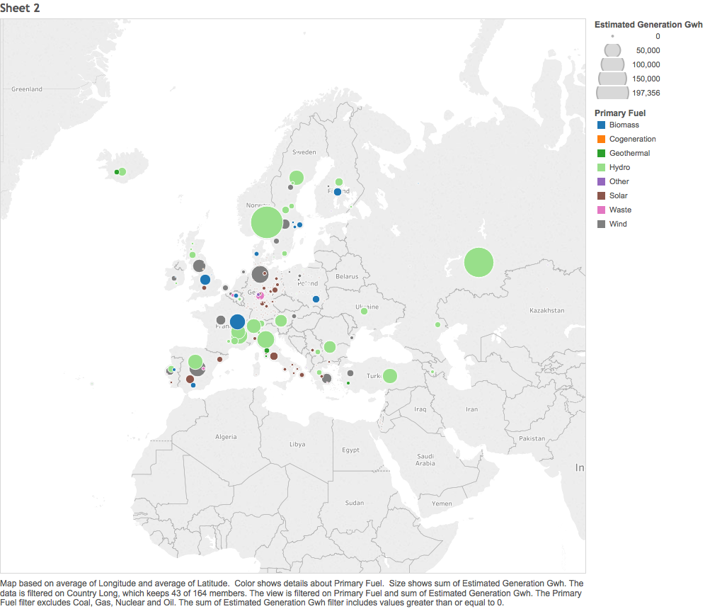
Source : Global Power Plant Database - Datasets - WRI ODP
Visual Design Type: : Symbol Map for renewable energy resources in Europe
Name of Tool: : Tableu
Country: : All European countries
Visual Mappings:
X axis: Latitude
Y axis: Longitude
Colour: primary fuel
Label: Source
Size: Estimated Generation Gwh
Unique Observation: : Hydro will be a massive contributor to renewable energy because of the many sources of having a large estimated generation of electricity
Solar is also a big contributor, but in a different sense, there is a lot of sources but they generate a lot less electricity separately than the Hydro sources
Data Preparation: Filtering countries to only display european, filtering fuel sources to renewable
I would like some feedback on my visualisation:
Could I have represented the key bits of data in a more effective manner? If so how?
What interactive features could I implement?
Thanks,
Cameron