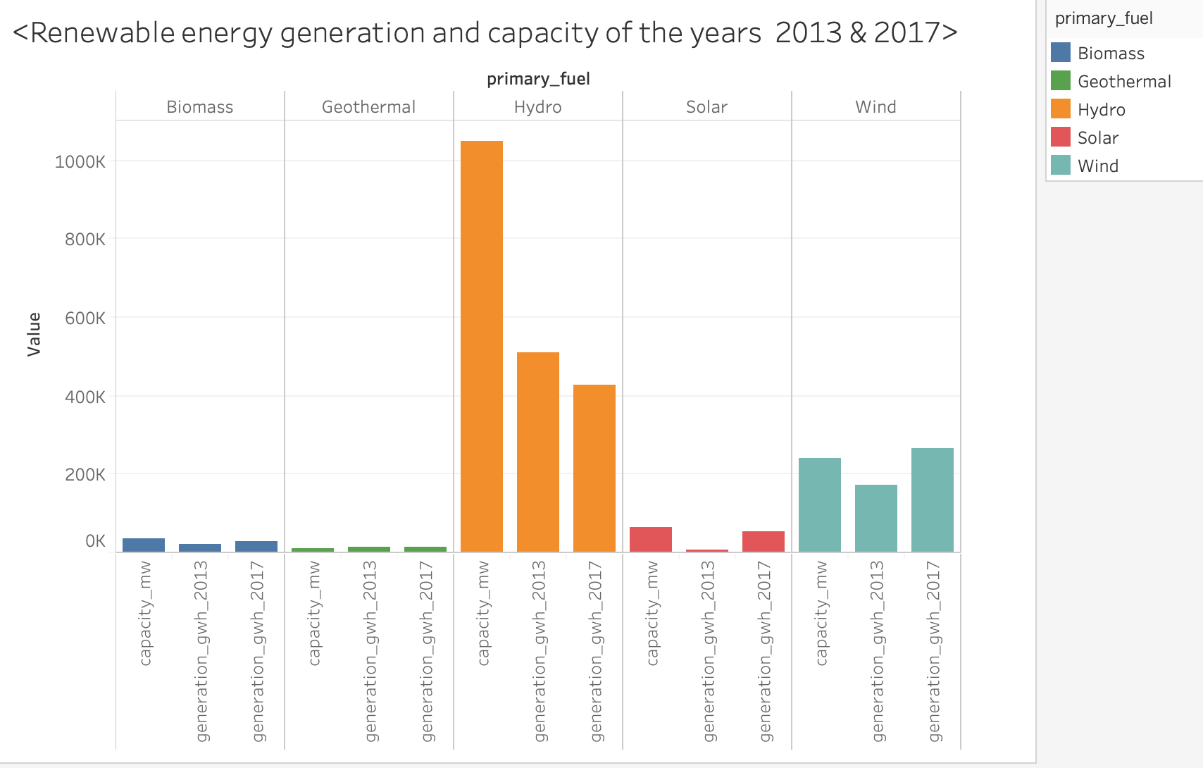
Visual Mappings: Color (Primary_fuel), y-axis (capacity_mw, generation_gwh_2013,generation_gwh_2017), x-axis (primary_fuel)
Unique Observations: My observation is that from 2013 to 2017 the generation of renewable fuels has increased except in hydro. Also the capacity of geothermal and wind is less than their generation in 2017.
Data Preparation: I convert the file from .csv to .xlsx
Questions:
1)Does my visual design make sense?
2)How can my visual design be improved?
This design makes sense in terms of comparing between power generation in 2013 and in 2017, as well as comparing generation totals from different primary fuel sources.
However, it seems that while the unit for generation is gigawatt-hours, the unit used for capacity is megawatts. Since these are different units, this visualization does not currently aid direct comparison between generation and capacity. This could be improved by using separate visualizations for generation and capacity, or by converting between gigawatt-hours and megawatts. (although you might need to make assumptions about how much time a power plant spends running in this case)