Relationship between Primary Fuel Sources and Secondary Fuel Sources using Radar Chart

Hi everyone,

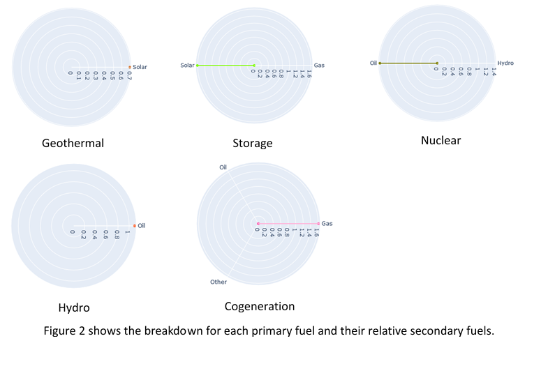
Hope you are having a great day. Inspired by [1], I am trying to find the relationship between the primary fuel sources and its secondary fuel sources (i.e. what secondary fuel is likely to occur given the primary fuel) using radar charts. There are two figures below, the first one showing the overall plot of the primary fuel sources against their secondary fuel sources and the second figure showing the breakdown of each primary fuel source.

Image:


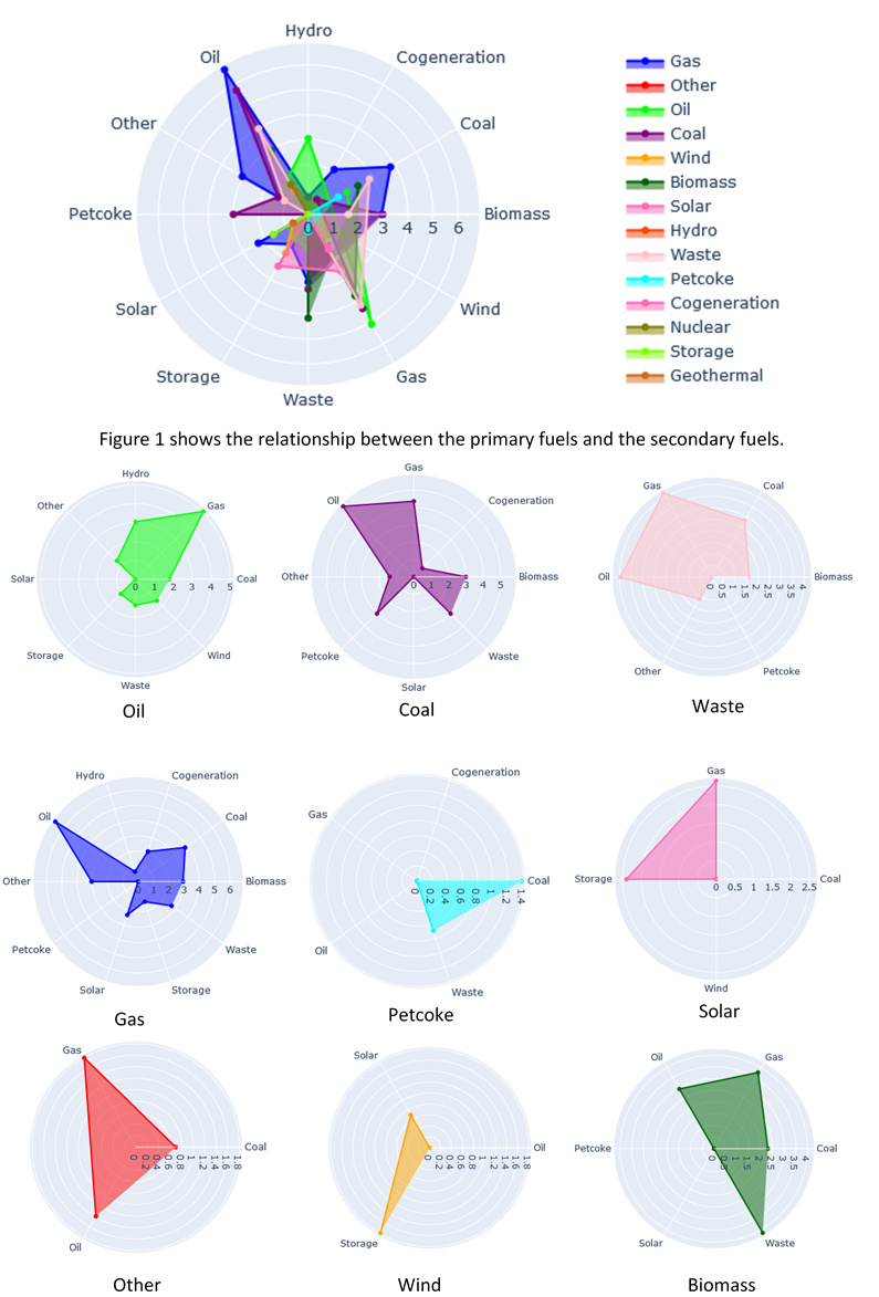
Visual Design Type : Radar Chart

Name of Tool : Plotly and Matplotlib

Country : All countries

Year : All years

Visual Mappings :
The axis of the radar chart provides one axis for each secondary fuel source (hydro, cogeneration, coal, biomass, wind, gas, waste, storage, solar, petcoke, other and oil). The colour shows the type of primary fuel sources. The shape and size allow us to see which secondary fuel source is related to the primary fuel source (i.e. how likely is the secondary fuel source to occur given the primary fuel source). The bigger the area/shape, the more the correlation between the primary fuel source and its secondary fuel sources.

Unique Observation : From the radar chart, we can see that most of the non-renewable energy like coal, oil and gas are correlated to one and another.

Data Preparation : The dataset is filtered so that it does not include any null values. For each primary fuel source, the sum of each secondary fuel source is calculated. The axis of the radar is then calculated by getting the maximum and the minimum counts secondary fuel source respective to their primary fuel sources. As the maximum for certain primary fuel sources such as Coal, Oil and Gas are higher than most of the other primary fuel sources, we used the logarithmic function to normalize the radar.

Source : http://datasets.wri.org/dataset/globalpowerplantdatabase

References:
[1] Holtz, Y. (n.d.). The Radar Chart and Its Caveats . Retrieved from from Data to Vis: https://www.data-to-viz.com/caveat/spider.html

[2] Christian Partl, P. P. (n.d.). Star Plots: A Literature Survey. Retrieved from https://courses.isds.tugraz.at/ivis/surveys/ss2010/g4-survey-starplots.pdf

Questions :

  • Is the choice of colour appropriate? As there are too many colours (primary fuel sources), it might be hard to understand the visualisation.
  • Should I get rid of the primary fuel sources that have smaller number of secondary fuel sources such as Geothermal, Storage, Nuclear, Cogeneration and Hydro?
  • Is there any suggestions that I can further improve on my data visualisation?

Thank you for reading and your suggestions are much appreciated! :smiley:

I find this a great representation of relationships between primary and secondary fuel. I like how it there is an overall graph along with one that is individual.

But I do have some suggestions

Individual graphs

  • Maybe it might be best to make the individual ones also have the same scale so it can be easily compared to one and another. For example Oil and Petcoke at first glance can be seen to have similar maximum value but that is not the case.

  • Also, have the same secondary fuel labels on the outer ring as the overall graph. It will make it easier to compare the overall one to individual. For example, Oil in the overall graph has a different shape to the individual one. And since the secondary fuel labels are in different places for individual ones, it can be hard to see how two or more actually overlap.

Overall graph

  • The colour in my opinion is a bit chaotic. They are overlapping with one and another quite a bit, but this can be hard to fix. Maybe there are better colour choices that can show the differences.

Further information extraction

  • It might be interesting to see if a powerplant has renewable energy source as their primary, is it also the case that their secondary fuel source is also renewable? Or vice versa for non-renewable.

But overall, I really like the design idea you went for. Its nice to see the relationships of primary and secondary fuel.

Hi,

It might be hard to clearly see the overlapping areas of the different colours. In my opinion, it could be visibly clearer if you could try out some colour combinations or set higher transparency for some colours. Keeping the primary fuel sources in the second figure would be better if you were to show the relationship between primary and secondary fuel holistically. Overall, it is a great idea to visualise the relationship this way.

Neat representation to show the correlation between two data but as mentioned above, it can get messy since the image aren’t too big and yes, there’s too many colour. Getting rid of some data is plausible if those data are trivial and pure noise (but rare to know for certain that they are noise).

Maybe using other library that can animate the graph ?

Overall is quite good to observe the relationship between primary and secondary fuel. However, in the overall graph it is quite difficult to see and find one and other relationship since there are too many colors overlapping each other. It will be great if is so interactive graph. Also, I agreed with @SwanseaStudent comment above; the scale of the individual graph and the position of the secondary fuel should be consistent so that we can make comparison between them.