Hi all, I am a Swansea University student looking for advice on my visualisation of power plants. The main task of the visualisation is to show the relationship between number of plants and electricity generation in 2017.
Design
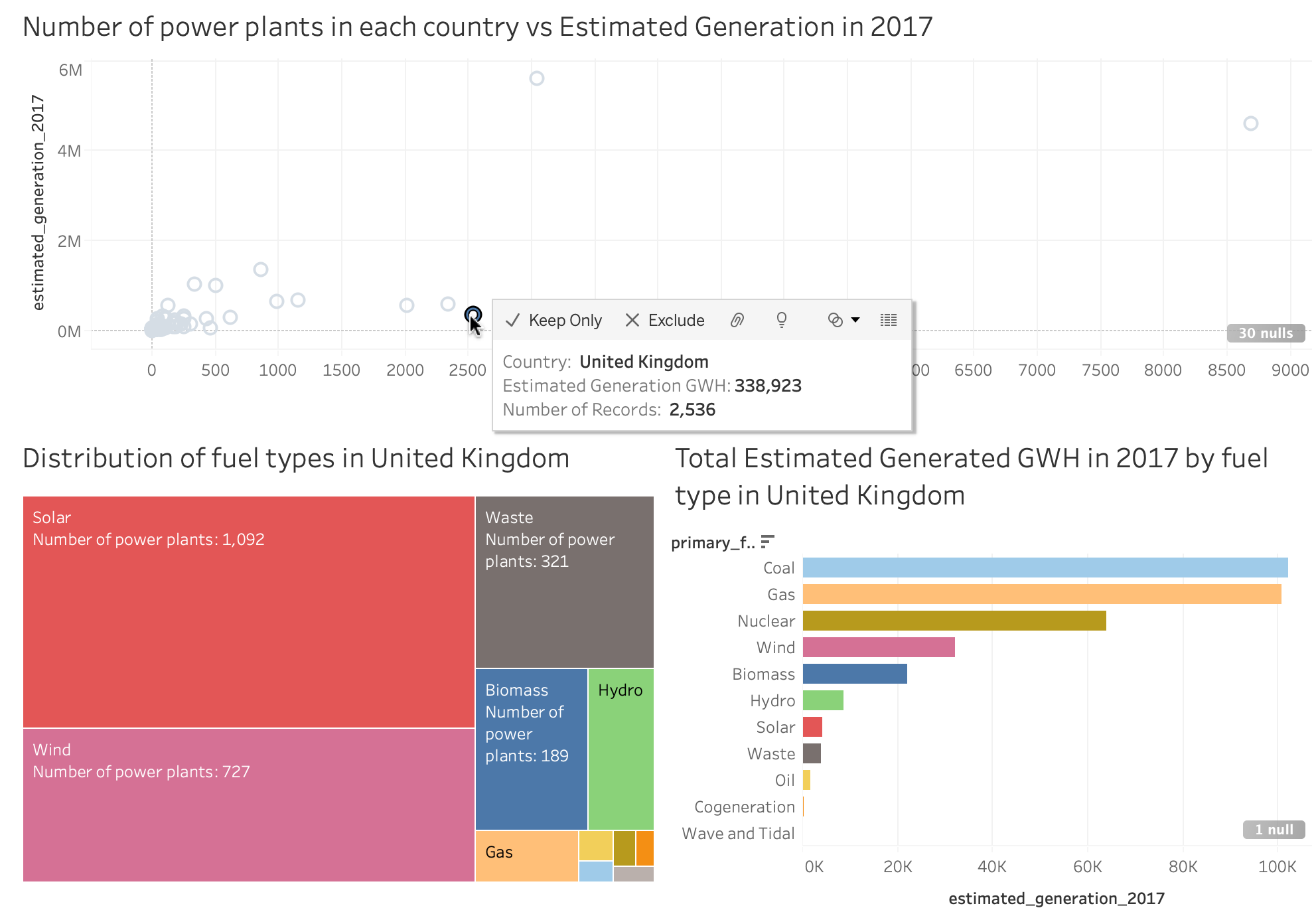
Visual Design Type: Coordinated multiple linked views (Scatter plot, Tree map, Bar chart)
Name of tool: Tableau
Country: All
Year: 2017
Visual Mappings:
- Colour: The main use of colour is to represent different fuel types that is found in the selected country.
- Interaction: The user can click on the points on the scatter plot which will modify the bottom two views to show the distribution of fuel types and their generated power.
- Hierarchy: The tree map represents the total number of power plants, and it is split into different fuel types.
- Position of views: The scatter plot was placed on top filling the entire width to bring focus to the user as it is the only part with interaction. Supporting views on the lower half of the design are placed side by side for convenient comparison.
- Size: For the tree map the size is determined by the number of power plants.
Observations:
- There is a positive correlation between electricity generated and the number of power plants.
- However, looking into some outliers like the United Kingdom it has a high number of power plants but low electricity generation. They have over 1,000 solar power plants which produced 4,050 GWH and they have 8 recorded coal power plants which produced 102,014 GWH. This suggests that the number of power plants may not have a significant effect on the electricity generated but the fuel type is more important.
Source: Global Power Plant Database - Datasets - WRI ODP
Questions
- Do you think this design helps achieve the task of showing the relationship between number of plants and electricity generation?
- Is the supporting views (lower half) effective in comparing with each other or should I use the same design for both (2 bar charts instead of tree map and bar chart)?
- What other ways can I represent the relationship between the number of power plants and electricity generation?
Thanks for reading!