Scientists think that the rainbow colormap is a standard choice, but since it is constructed in RGB color space, it will be different on each individual monitor, projector, or printed page. Also, there are different rainbows, that is, different trajectories through color spaces that span the spectral colors. And, if you look at the use of the rainbow in practice, you’ll see that individual scientists tweak the max, min, and control points to better reveal features in their data. So, in reality it’s a false “standard.”
Since people do not use calibrated displays or color systems, the best a vision scientist can do is provide guidelines that can at least prevent users from falling off a cliff. First, what is the task the user is trying to perform? If the idea is to select 8 colors for in a scatterplot, then hue variations are great, since the perceptual dimension of “hue” is categorical. That is, we perceived color names, as Newton observed: Red, orange, yellow, green, blue, indigo, violet. Or, using the rainbow, Red, orange, yellow, green, cyan, blue, and maybe magenta. The problem with the rainbow color scales is that these color name categories occupy different amounts of real estate in the color scale. Yellow is tiny, green is large. So, two selections in the “green” area can look identical perceptually, making them really bad candidates for representing different categorical values. If you want to use a rainbow here, at least use a segmented rainbow and tune the values so that each segment looks perceptually different. And, check the results at different sizes, since the smaller the size, the less saturated a color will appear.
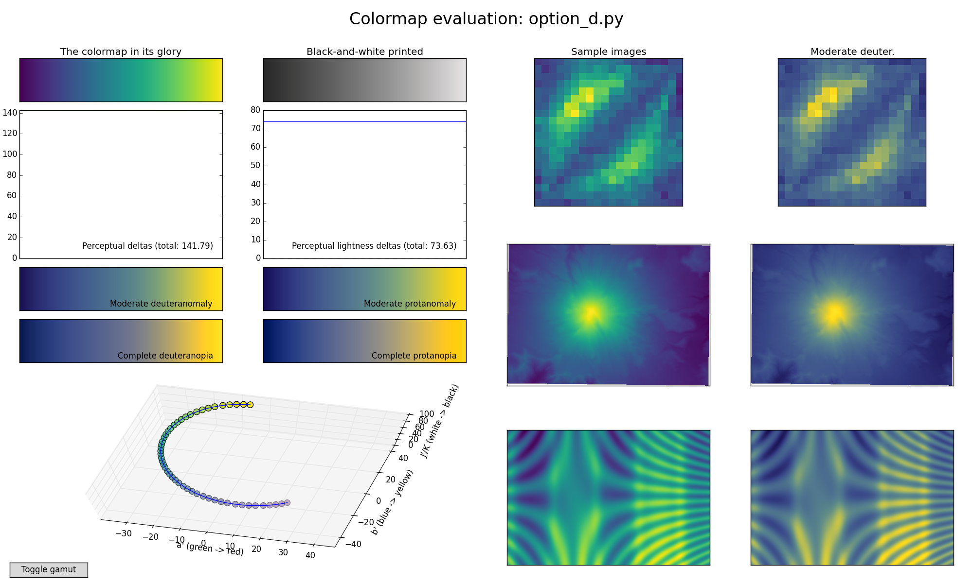
For scalar fields, a major task is to represent magnitude variations over space. For this, the perceptual dimension “luminance” or “value” is the dimension to use. Pick a color scale that goes smoothly from the darkest dark you can produce to the brightest bright, that is, giving yourself the maximum dynamic range you can. Some researchers will advise you to pick a color scale that spans the biggest distance (most just noticeable differences) in a color space. This is ridiculous. If you map your scalar data onto a range of values that cover a long distance in color space, but have no luminance variation, you will basically see absolutely nothing. (See Rogowitz and Kalvin’s Which Blair paper for examples). The visual system needs luminance variations to variations across space. The only exception to this is if the data are very low spatial frequency, e.g., the earths’ magnetic field, where variations in saturation will produce a more faithful representation of the smooth variations in data value. Lloyd Treinish and I suggested a “standard” color scale in our How (not) to Lie with Visualization paper, which had a high-dynamic range monotonic luminance variation (for the high spatial frequencies) plus a divergent R-G or B-Y saturation variation (for the low spatial frequencies). It would be interesting to test this experimentally.
If you map a rainbow onto a scalar field, you have two problems. First, the rainbow is not monotonic in luminance, so equal steps in data value do not look like equal steps perceptually. Second, the rainbow scale is perceptual divided into hue bands. If you have a feature that happens to occur at one of these transitions, then terrific, you have great visibility into that spatial pattern. However, if a feature lies within a band, that variation in data value will be invisible to you. This is particularly dangerous when you don’t know the shape of the data ahead of time, since your pattern-recognition mechanisms will happily go to work interpreting the pattern that appears on the screen. However, that pattern may not reflect the structure in the data, and unimportant variations may be prominent and important features may be totally masked.
Since the three dimensions of color perception (hue, saturation, and luminance) are independent, you can use the different dimensions independently. For example, you can create a monotonic luminance color scale and also use hue to provide highlighting cues. Tamara Munzner picked up one of our examples for her book, where the elevation of the earth is shown in a color map that is BOTH monotonic in luminance (so you can see the features in the data) AND has a hue discontinuity at sea level to breath insight into what goes on above and below sea level.
Even within a single data type, there might be different tasks. For environmental data, for example, a typical data type is a scalar field. However, you may want to judge the magnitude of a region, or you may want to understand or compare the shape of the magnitude variation over space, or you may want to highlight a spatial feature in the data. And, these data may be time-varying. And, the data may have different spatial characteristics (e.g., low of high spatial frequency variation). You want to make sure that the way you map data magnitudes onto triplets in a color scale reveal these features and don’t introduce artifacts.
We have a paper in press in TVCG (with Aritra Dasgupta, Jorge Paco, and Enrico Bertini) where we explore three different climate modeling tasks with three different colormaps. In this paper, climate scientists compared an overall measure of temperature (GPP) between two maps, which were varied in their spatial similarity and magnitude range similarity. We co-varied two characteristics of color maps, whether the luminance values were monotonic with data values, and whether the color scale produced color bands (pseudo segmentation). For magnitude judgments, users were uniformly more accurate with color scales that provided monotonic luminance variations, with the rainbow providing the worst performance. When judging spatial variations or identifying the spatial position of maximal difference between scalar fields, the segmentation of the data into perceptual bands could provide a advantage over the monotonic luminance maps. The Rainbow was rarely superior, but the users uniformly rated it as having the best beauty and familiarity, but they also felt more confident using it, and, most strikingly, overwhelmingly believed that it provided better accuracy!
So, here are my guidelines:
First, use color scales created in LAB color space, or some other space where the perceptual dimensions of hue, saturation and luminance are respected. Quick warning: there are lots of color spaces that use words like hue, saturation and luminance, but which do not provide independence. That is, a variation in “saturation” might also be varying the luminance, a variation in “hue” might also be varying saturation, etc.
Second, take a look at your color scale in black and white. You can do this programmatically or just print it out and create a black-and-white copy. The color scale that has the biggest variation from dark to light, where the luminance varies smoothly and monotically, from dark to light is the best for representing magnitude information. It can also vary in hue and saturation. But, high dynamic range, monotonic luminance is your friend.
Third, make sure you have articulated the task your user is performing and select variations in hue, saturation and luminance that are appropriate. Do you want your user to have a veridical representation of the data magnitude? Do you want a feature to “pop out”? Do you want to focus attention on a particualr range of data values ?
Hope this is useful.
Bernice
