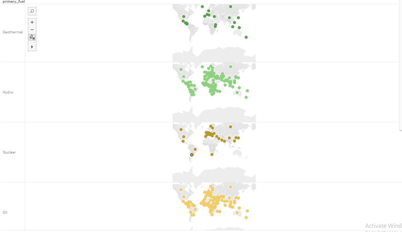
I’m trying to show the proliferation and trend of primary fuel for power generations globally. I’ve made this map chart to attempt to show this but I was wondering if anyone had any ideas on whether it could be done better another way, or if I could modify my map chart to be more clear. My main concern is the number of views. I have tried combining them, however it is then not clear what fuel is used as the colours overlap each other.
Type: maps with detail on demand.
Name of Tool: Tableau
Country:All
Year: All (all power stations assumed to not be decommissioned)
Visual Mappings: Fuel source is mapped to colour. The fuel source is also mapped to a country.
Unique Observation: Fuel source seems to depend on the location of the power plant. While gas and oil seem to be used all over the world, the use of wave and tidal seems to be located only in developed non-land locked countries and nuclear appears only in a few countries (perhaps restrictions on use).
First of all: Great visualization ! It gives a good overview of what you want to show and you can see some interesting trends.
Here would be some suggestions from my side to make maps clearly arranged
I would arrange the four visualizations in a 2 x 2 grid compared to your 1 x 4 format as it allows you to have a better way of comparing the different visualizations to each other.
Using color is good way to distinct between the different fuel sources, but I think by using useful symbols that represent each of the fuel sources (eg. radioactive symbol for nuclear,…) might be more intuitive.
There is a lot of overlap in your points which represents the fuel sources, which could be avoided by using a choropleth map which would also be very interesting to see in which region, how much of each fuel source is used compared to others.
As your main concern is the number of views of the fuel sources, I would propose an interactive feature. The feature would allow you to click on eg. a country or continent, and show you a stacked bar chart of the percentage of each fuel source in this country or continent. By doing this you can still have an overall view of the maps but also get to combine the views.
I hope my suggestions were understandable and you can incorporate some of them in your visualization