Image:
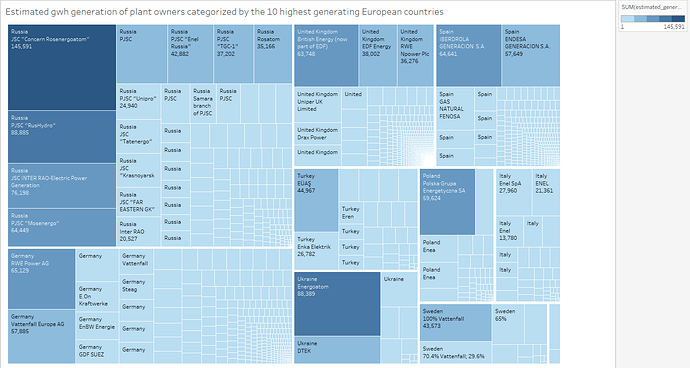
Visual design type: Treemap
Name of tool: Tableau
Countries: Russia, Germany, United Kingdom, Turkey, Ukraine, Spain, Poland, Italy, Sweden, France.
Visual Mappings: Colour represents the amount of gwh each plant generates, plants are represented as rectangles and the numeric values displays the amount of power generated.
Unique Observation: Russia is the highest generation country despite not having the largest number of power plants.
Data preparation: Only plants that generated at least 1gwh are included. Stepped blue colour ranging from light to dark to show the comparison between high and low generating plants.
Questions:
- Is the treemap clear and understandable or is more information required?
- Is the chosen colour scheme appropriate for all people, colour blind etc.
- Are there any improvements regarding the chosen data set or visualisation design that could be made?

