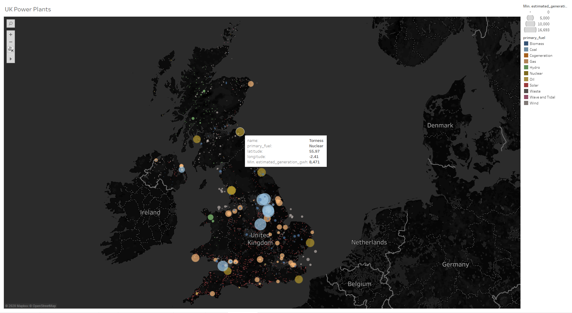
Hi all, I am another student from Swansea please find below one of the submission for a visualisation. It aims to display the distribution of plants around the UK as well as the type of fuel they use and their estimated power output.
Visual Design Type: Map Plot
Name of Tool: Tableu
Country: UK
Year: 2017
Visual Mappings:
• :
Location : The GEO coordinates (Latitude/Longitude) of the plant.
• :
Size : Estimated Generation GWh
• :
Colour : Primary fuel source
Unique Observation: Nuclear and Coal plants have the highest estimated generation overall. Most of the UKs Col plants are found between Nottingham and Leeds. Also, it can be seen than the UKs solar plants are in a higher concentration to the south and the higher generation estimation for wind power are from offshore windfarms.
Data Preparation: All Null values were removed where applicable.
Question:
- Can meaning be extracted from the visualisation?
- Is the visualisation appropriate?
- Is there a way I can increase information output without introducing clutter to the visualisation?
Hi,
I’ll try and answer your questions the best I can.
- Yes. You can see where each power plant is in the UK as well as the fuels they use for their electricity generation. The colour that categorises each fuel is distinct enough to tell which fuel is which on the visualisation. The size of each circle shows that the larger it is, the higher the estimated output for that power plant is.
- Yes, I believe this is the most appropriate visualisation for your given task to show where the power plants are in the UK (the map). It’s good that you’ve lowered the colour opacity of the circles to show other power plants that may have been covered completely without that. The tooltip will help to display exact values (estimated output), the name of the power plant as well as its primary fuel source.
- Not sure on this part, but you could allocate ‘meaningful’ colours to each fuel i.e. grey for coal, yellow for solar and light blue for wind. Also, you could order the fuels on the legend based on the number of power plants in the UK using those fuels or the estimated electricity output from each fuel source. You could add a second view to show the number of power plants in the UK use each fuel source or something like that.
Generally, this visualisation is appropriate for your given task and it visually shows the estimated output from each power plant in the UK. However, I don’t think you need to show the longitude and latitude on the tooltip. It’s a good visualisation overall.
Hope you found this helpful!