Hi,
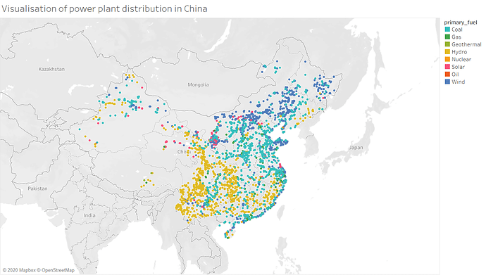
I am a Swansea University student and I am new to data visualisation. This is the first data visualisation that I have ever produced. I am looking to further improve my skills in visual designs and I am looking forward to hear some advice from anyone who are experienced in visual design! Thank you!
Visual Design Type: Symbol Maps
Name of Tool: Tableau
Country: China
Year: All available dates
Visual Mappings:
- Colour – Primary Fuel
- Shape – Circle
Unique Observation: China has a significant amount of renewable power plants, majority of the renewable power plants sources are Hydro and Wind. However China still has a significant amount of Coal power plants. The Hydro power plants are mainly located to the mid-west of the country and the Wind power plants are mainly located by the coast and the North of China. As well as Coal power plants are located around the country.
Data Preparation: Filters out all countries apart from China
Source: Global Power Plant Database - Datasets - WRI ODP
Question:
- Is the visualisation clear?
- Is the choice of colour appropiate?
- Is there any suggestion that I can further improve my data visualisation?
