
Hi everyone,
Hope you are having a good day. I am another Swansea University student trying to create a map which shows all the power plants in China based on their primary fuels. There are two images, both having the same visualisation, just different in colours. Each colour in the map defines different primary fuels. The size of the circles denote the energy generated by each power plant (i.e. the larger the circle, the more energy produced).
Image:
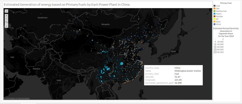
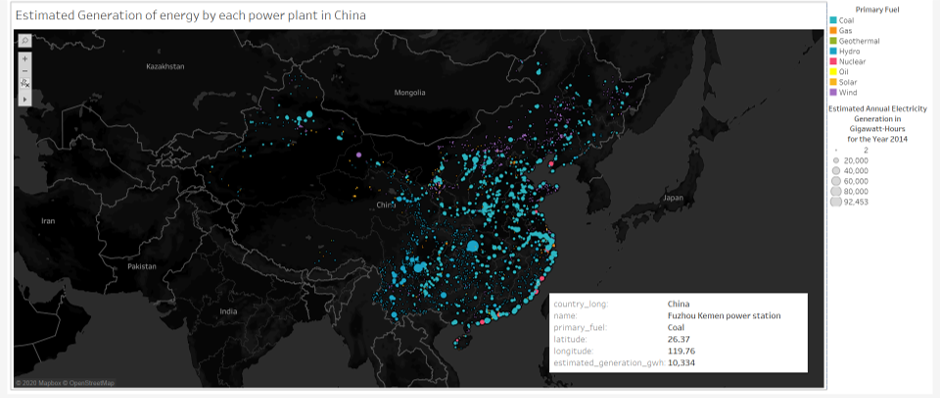
Visual Design Type: Symbol Maps
Name of Tool: Tableau
Country: China
Year: 2014
Visual Mappings:
X Axis: Latitude
Y Axis: Longitude
Colour: Primary Fuel Type
Shape: Circle
Size: Estimated Annual Electricity Generation in Gigawatt-Hours for the Year 2014
Unique Observation: From the symbol map above, we can see that the East part of China has more power plants than the West part of China. We can also see that most of the primary fuel types are coal and hydro. The largest electricity generation power plant is hydro.
Data Preparation: The dataset is filtered so that it does not include any null values. It is then filtered out all countries except China.
Source: http://datasets.wri.org/dataset/globalpowerplantdatabase
Questions:
- Does the visual design make sense?
- Is the choice of colour appropriate?
- Is there any suggestions that I can further improve on my data visualisation?
Thank you for reading and your suggestions are much appreciated! 