I just went through my posted answer and realized that some sentences weren’t as coherent as I thought they would be. Therefore, I edited some parts and made a new post.
Hello konulv
I’ll share with you my opinion about the mentioned visualization, basing them on well-known principles and guidelines, and my personal experience.
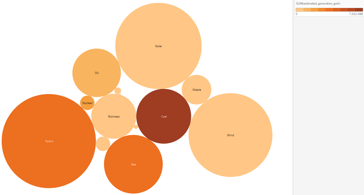
#1 Area
I think it’s safe to say that the most prominent feature of this visualization are the colors and the size of the bubbles. The issue of working with area in general is, based on the studies performed by William S. Cleveland and Robert McGill or the paper published by Balakrishnan et al. (2007), that it’s hard to compare the different data points. For example, we can see that the area of Hydro is larger than the area of Wind or Coal. Although we clearly see a difference between the Coal and the Hydro bubble, it’s hard to tell “by how much” the former is bigger than the latter. In addition, at first sight, it is hard to see the difference between the Hydro and the Wind bubble.
Since, I assume, you want to emphasize that the number of power plants does not correlate with the combined energy output, I recommend underlining that differently than with the size/area of the bubbles. Therefore, I would suggest using a different visualization type, like a vertical bar chart, though it only addresses the problem with the perception of area and would force you to rank the data and add a description (describing the chosen ranking of the power plants).
#2 Sorting
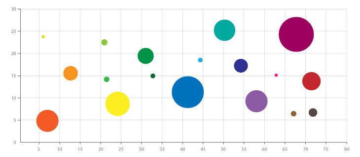
Another problem that I’ve found was the missing sorting. It seems like the circles have been placed arbitrarily, making it difficult for the observer to understand the visualization. There does not exist a sorting, which is a weakness of Packed/Circular Packed Bubble Charts.Yalcin et al. (2019) have found similar results. To solve the sorting problem, I suggest using a bubble chart visualization within a coordinate system (Example) or simply a coordinate system, exchanging bubbles for labeled coordinates. In this instance, the position of each data point has a meaning, and a ranking can be perceived, which is, I assume, what you wanted to portray.
#3 Visualization type
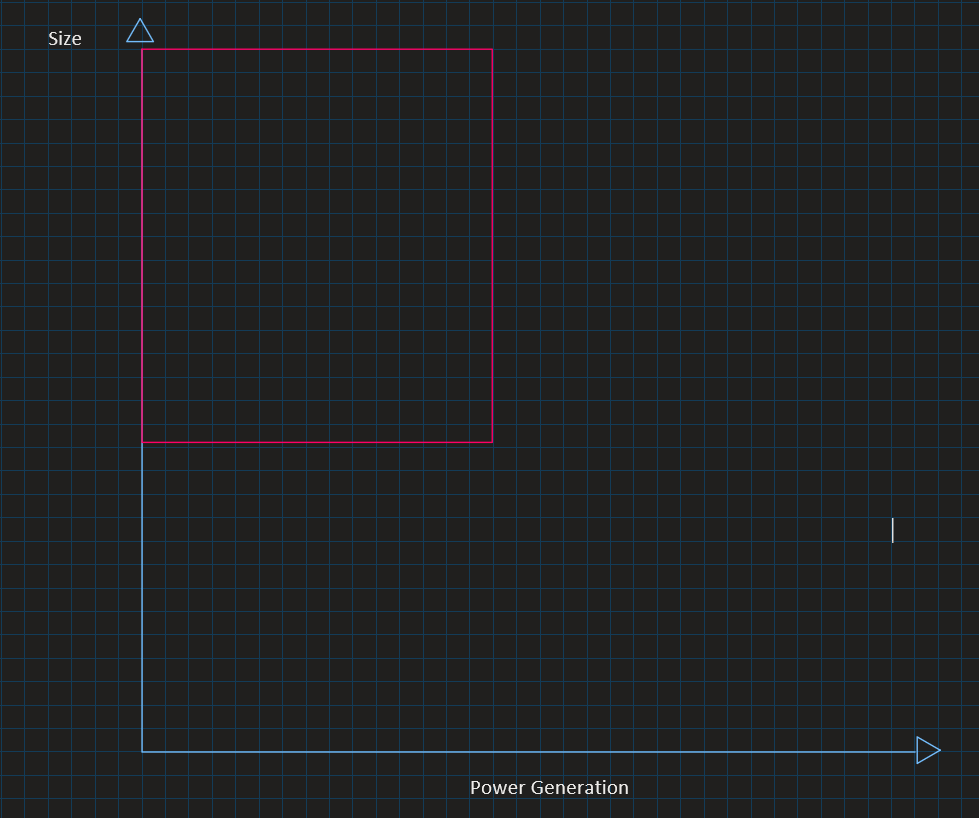
In addition, based on Tufte’s principles, I don’t think the Data-ink ratio is as efficient as with other visualization types for this style of visualization. As mentioned before, one could use a coordinate system with Size on the Y-Axis and Power generation on the X-Axis to present the same data. Not only does it eliminate the issue with the perception of area, but it also greatly increased the Data-ink ratio, as the bubbles can be replaced for uniform dots/coordinate. Since the bubbles don’t overlap but touch each other, they create a lot of “wasted” space (white areas). Therefore, the change will eliminate that unused space problematic, which could also contribute towards maximizing the Data-ink ratio.
Moreover, your goal is to emphasize the small contribution of solar and wind plants toward the energy grid - thus, we need to highlight that aspect in the presented data, which the visualization currently lacks. Here too, by using a coordinate system, we can portray that aspect by placing the wind and solar data points towards the top-left corner, assuming we are using the above-mentioned coordinate labels (Visual example).
Another argument that speaks against a Packed Bubble Chart, to display this kind of data, are the small bubbles that don’t have a label. This, arguably, violates Tufte’s Principle of Graphical Excellence, since the unlabeled bubbles can be considered as chart junk or do not meet the followed criteria: complex ideas communicated with clarity, precision and efficiency.
Nevertheless, Packed Bubble Chart has its uses, especially for the visualization of uncertainty. In the paper of Weiskopf, Görtler, and Schulz (2018), you can find some examples.
#4 Colors
Although many research papers like Maureen Stone’s article Choosing Colors for Data Visualization (2006) suggest "limiting hue to a palette of two or three colors, and using hue and chroma variations within these hues to create distinguishable different colors" (Maureen Stone (2006)), I find it hard to distinguish the colors on the lower and higher spectrum. For example, I took me a while to notice the difference in color of the Oil and the Solar bubble. Although I must say that opting for different chroma and a discrete palette of colors, rather than a continuous, to display the data range was a good decision, as, from my own experience and according to Mike Yi’s article How to Choose Colors for Data Visualizations (2019), we humans are not able to precisely differentiate between a continuous range of colors.
I hope these comments are helpful for further proceedings.
Best,
DNBVis