Hi,
I’m working towards producing a Star Glyph with five points, and I’d like to seek some advice regarding the parameter mapping.
I am attempting to follow the parameter mapping guidelines explained here [1].
Vis Generated with Matplotlib
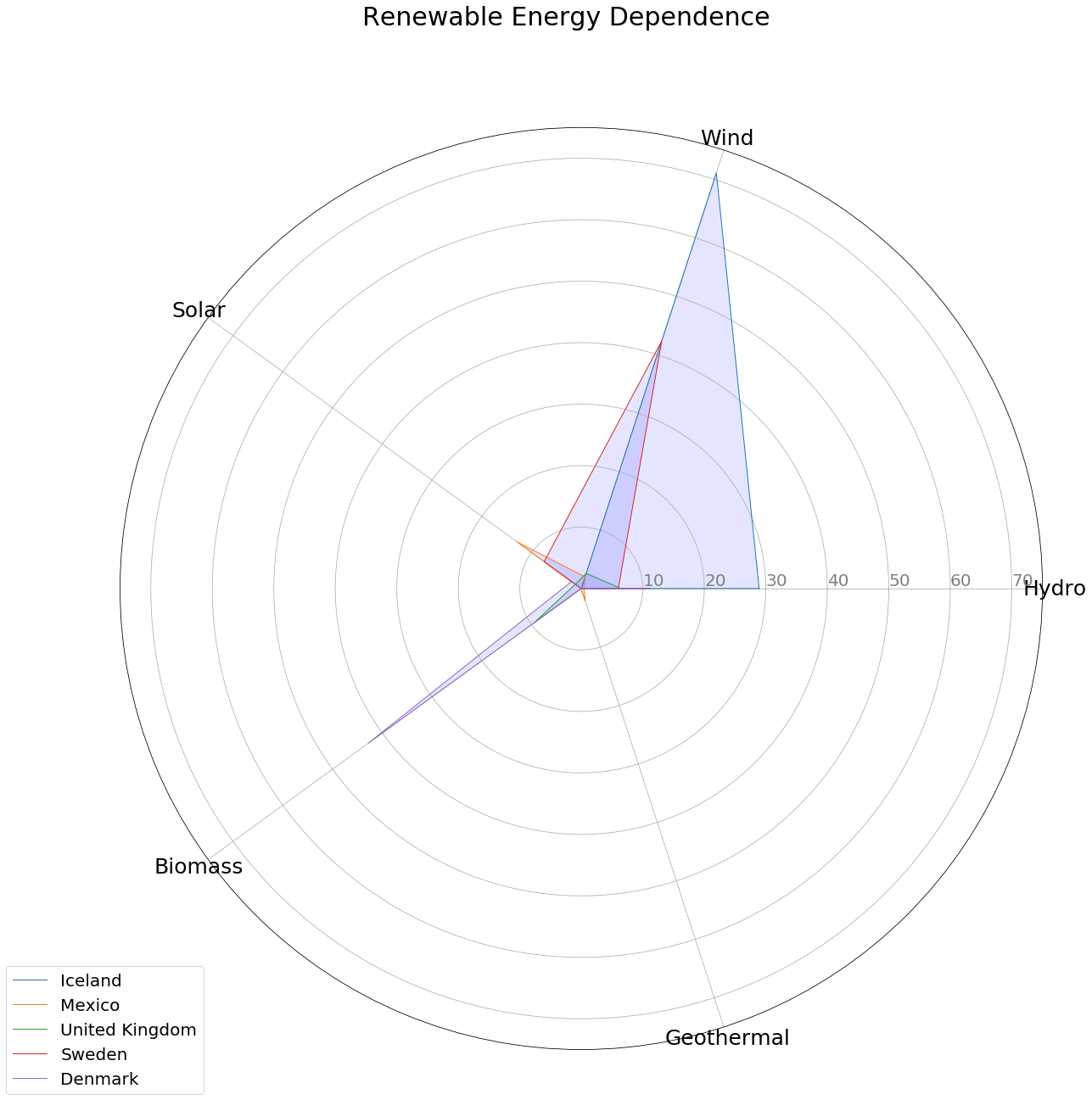
Using the power plant dataset found here, I calculated the percentage breakdown of which sources generated each country’s power. I then filtered these values to only include the five renewable energy sources I was interested in plotting.
Each of these energy types is then encoded onto its axis between 0 and a limit I set.
As these values all have a theoretical maximum of 100 (If a country generated all of its power from one source) I first decided to simply set the plot limit to 100, however as the actual maximum value is around 70 and the average much lower, this made all data too small and hard to interpret.
I then tried to set the limit of the plot to the maximum value provided from the data set, however as this was not a particularly round number, reading the chart was rather hard, compromising I set the limit to 75.
As such I ask the following questions:
- Does the percentage reliance create normalized glyphs (Does the glyph appear distorted)?
- Does having a scale cut off of 75% rather than 100%, would it be better to use a categorical scale as suggested in section 3.1.1[2]?
- Should any further information be provided alongside the visualization, or is the more recent association of radar plots enough?
- Are you able to tell roughly the amounts by which the displayed countries rely upon each renewable source?
Thanks,
Joan
References:
[1] - R. Borgo, J. Kehrer, D. H. Chung, E. Maguire, R. S. Laramee, H. Hauser, M. Ward, andM. Chen, “Glyph-based visualization: Foundations, design guidelines, techniques and applications.” in Eurographics (STARs), 2013, pp. 39–63.
[2] - C. Partl, P. Plaschzug, D. Ladenhauf, and G. Fernitz, “Star plots: A literature survey.”