Visual Design Type:
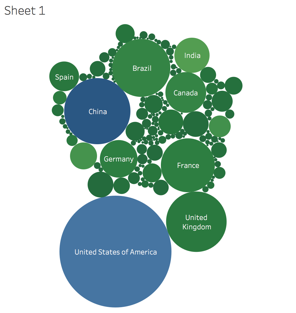
Packed bubbles representing national power output totals.
Tool
Tableau Desktop
Visual Mappings:
Countries
Sum of power output in Mega watts
Observation:
Top countries:
USA,China,UK,Brazil,France,Germany,Spain,India,Canada
Questions:
1.Is this an effective representation for country power production, how can I improve it?
2.What would be an color scheme to use to show variation?
It is hard to notice difference in circle size in visualisations, and the colours are similar also. There’s also missing labels for the circles that do not fit. I would suggest either during the data to show the largest output countries only, or choose a different visualisation, possibly a colour coded scatter graph, with fingered days to highest types again.
This is a good guide to read up on data visualisation that are good or bad in some situations.
#MakeoverMonday: Improving How We Visualize and Analyze Data, One Chart at a Time.