
Hi guys, I’m a Swansea University student looking for some feedback on one of my visualisations of a global power plant database. I appreciate any time taken to review the visualisation and leave any feedback possible if necessary.
Here’s the source of the data: http://datasets.wri.org/dataset/globalpowerplantdatabase
Image:
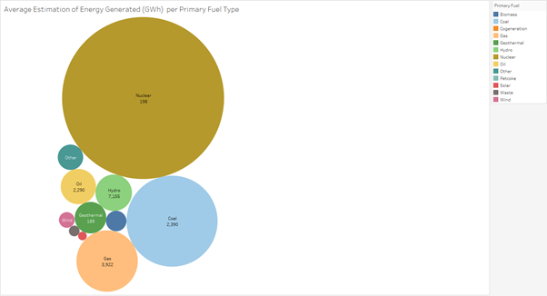
Visual Design Type: Packed Bubbles
Name of Tool: Tableau
Country: N/A
Year: N/A
Visual Mappings:
Detail - AVG(estimated_generation_gwh)
Label – primary_fuel
Label – CNT(primary_fuel)
Colour – primary_fuel
Unique Observations:
Average estimated energy generation per primary fuel type.
Number of power plants of each primary fuel type throughout the world (within the database).
Energy generation differences dependent on fuel type.
Visualises the importance specific power plants being built depending on population density of regions. (One nuclear power plant would be more suitable to power a city like London in comparison to one wind power plant).
Data Preparation: Filters used in Tableau to retrieve new values, no modifications made to the original dataset.
Questions:
- Does the visualisation make sense?
- Have I selected an appropriate visualisation? If not, can you specify where to improve?
- What do you take away from the visualisation produced?
Thank you in advance for the help!