Hello everyone,
I have created a packed bubbles visualisation with data from the Global Power Plant Database [1] using Tableau Desktop and was hoping for some feedback on my design.
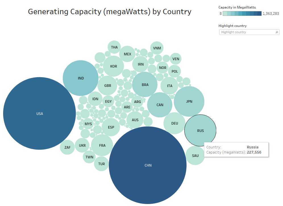
Visual Design Type: Packed bubbles
Name of Tool: Tableau Desktop
Country: CHN, USA, IND, RUS, JPN, BRA, CAN, FRA, DEU, KOR, …
Year: N/A
Visual Mappings:
Data:
- Label – country
- Detail – country_long
- Size – SUM(capacity_mw)
- Colour – SUM(capacity_mw)
Colour:
Blue-Teal, 10 step colour
Unique Observation:
From this visualisation, we can see that out of the 10 countries with the highest generating capacity (listed above), 8 of those 10 countries are considered the top 10 countries by GDP [2]. This suggests that there is a strong correlation between how developed a country is and how much electricity they can generate.
Data Preparation:
No modifications to the original data
Questions
- Does the visualisation make sense and is the visualisation clear?
- Is the choice of colour appropiate?
- Have I selected an appropriate visualisation design?
- Is there any suggestion that I can further improve my data visualisation?
Sources
[1] World Resources Institute Global Power Plant Database available at: Global Power Plant Database - Datasets - WRI ODP
[2] International Monetary Fund - World Economic Outlook Database (2017) available at: https://www.imf.org/external/pubs/ft/weo/2017/02/weodata/index.aspx