
Dear All,
I study Computer Science at Swansea University which now I am in the 3rd Final Year Of Bsc. I chose the Data Visualisation Course and I have to Visualize data for global Plants. Below you will find one of my visualisations figure and I would appreciate if you add your comments, opinions.
Thanks in Advance.
Description Template:
Image:
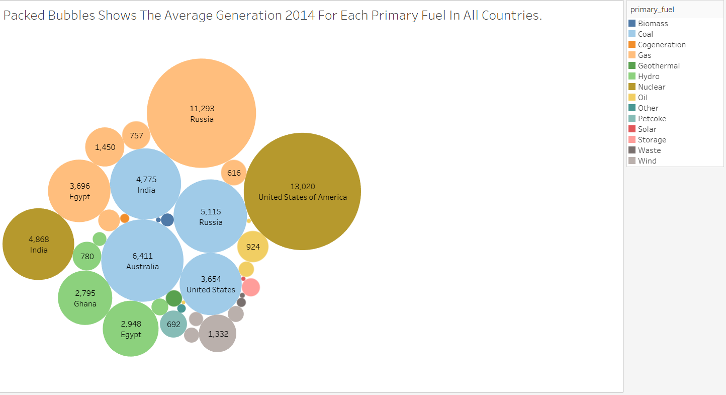
Visual Design Type: Packed Bubbles
Name Of Tool: Tableau
Country: Egypt, Ghana, India United States Of America, Russia, Australia.
Year: 2014
Visual Mappings:
colour: the colour shows the primary fuel.
size: the size is based on the average generation of 2014.
shape: the shape is based on the average generation of 2014.
label label shows the country and the average generation of 2014.
Unique Observation: The visualisation figure shows the Average Generation 2014 For Each Primary Fuel In All Countries.As we can see the United States Of America has the highest Average Generation in Nuclear. But on the other hand, United States Of America has the lowest average generation in oil.
Data Preparation: Convert the CSV File to XLSX File.
Source: http://datasets.wri.org/dataset/globalpowerplantdatabase
Question :
Does my visual design make sense?
Is my choice of colour map optimal?
Should I add more information for this specific Visualisation Figure?