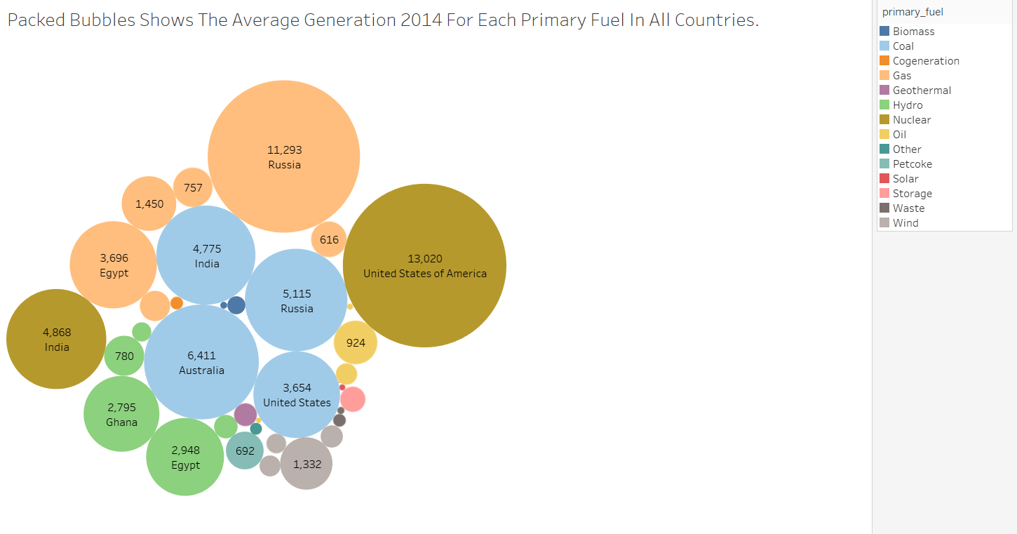
Thanks a lot for the responses and your opinions guys I tried to improve the visualisation design as you mentioned me with all the related information