Packed Bubbles Chart Shows The Average Gwh 2014 For Countries

Hello,
I study Computer Science at Swansea University which now I am in the 3rd Final Year Of Bsc. I chose the Data Visualisation Course and I have to Visualize data for global Plants. Below you will find one of my visualisations figure and I would appreciate if you add your comments, opinions.

Thanks in Advance.

Description Template:

Image:

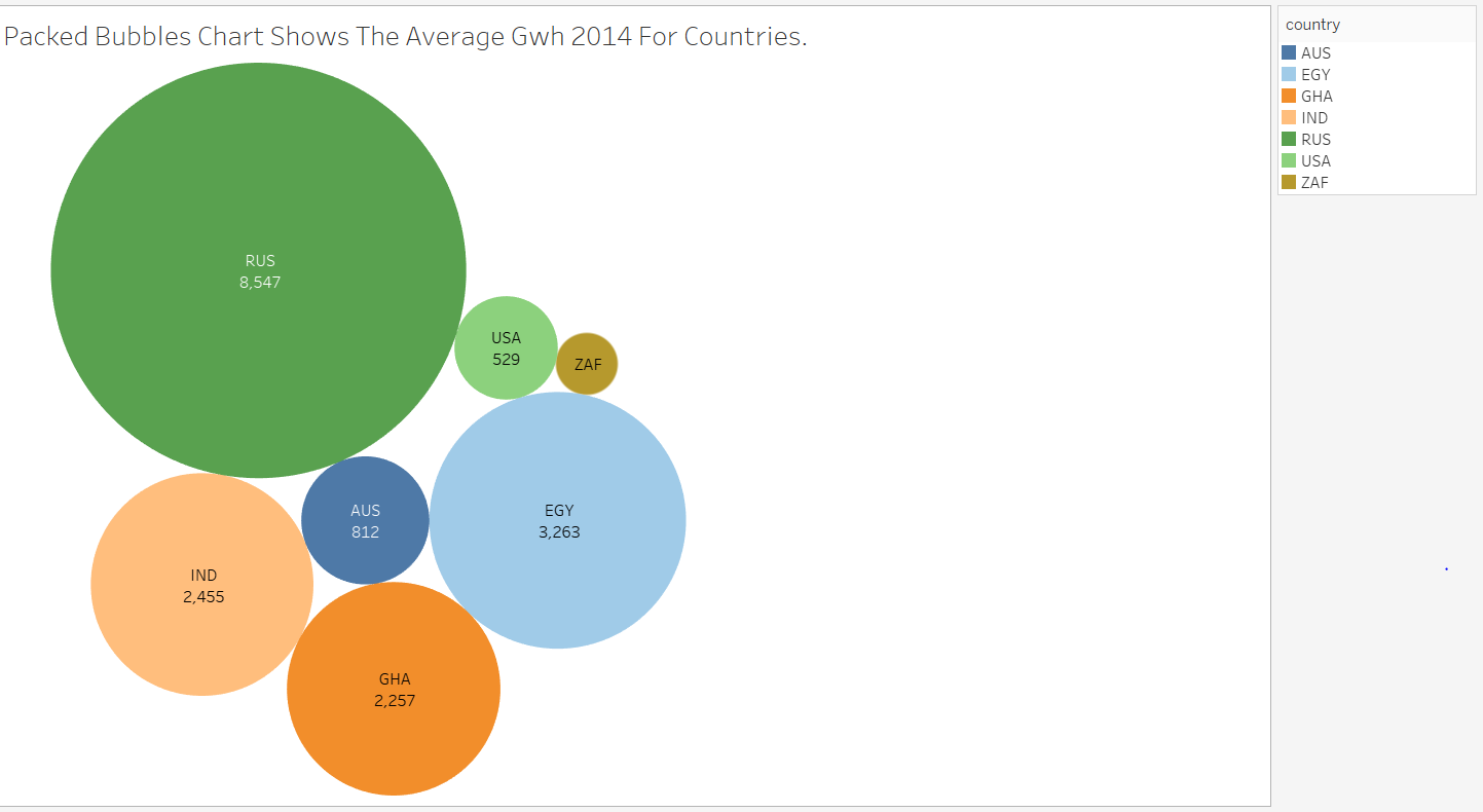
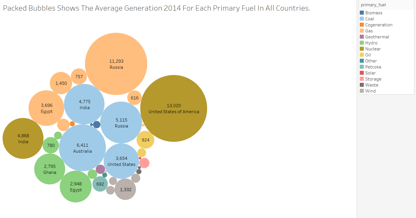
Visual Design Type : Packed Bubbles

Name Of Tool: Tableau

Country: AUS,EGY,GHA,IND,RUS,USA,ZAF

Year: 2014

Visual Mappings:
colour: Colour is based on the Countries.
shape: shape is based on the Average Gwh 2014.
size: size is based on the Average Gwh 2014 For Each Country.

Unique Observation:
This visualisation figure shows the Average Gwh 2014 For The Countries.
e.g.: Russia has the highest Average Gwh in 2014 and ZAF
has the lowest Average Gwh in 2014.

Data Preparation: Convert the CSV File to XLSX File.

Source: http://datasets.wri.org/dataset/globalpowerplantdatabase

Question:
Does my visual design make sense?
Is my choice of colour map optimal?
Should I add more information for this specific Visualisation Figure?

Hey there, if you are just trying to show the average production of each country I think the packed bubbles design is good enough although you could probably also used a heat map.

I will agree with @KleanthisLiontis. The colour is a visual encoding that could be used to enhance the information which you convey in the chart (i.e. try to put something inside). Moreover, I would have used the country_long dimension for the labeling due to the “code names” could be misleading sometimes.

Hello man,

The visual design type that you chose is really nice to visualise your data however I will suggest you to show the average for all the primary fuels in each country. It will be more understandable by anyone and also i will agree with @ThomasTasioulis to change the country to country_long. Also try to separate your data by using the size with the attribute that you want to show.

Thanks a lot for the responses and your opinions guys I tried to improve the visualisation design as you mentioned me with all the related information