Hi!
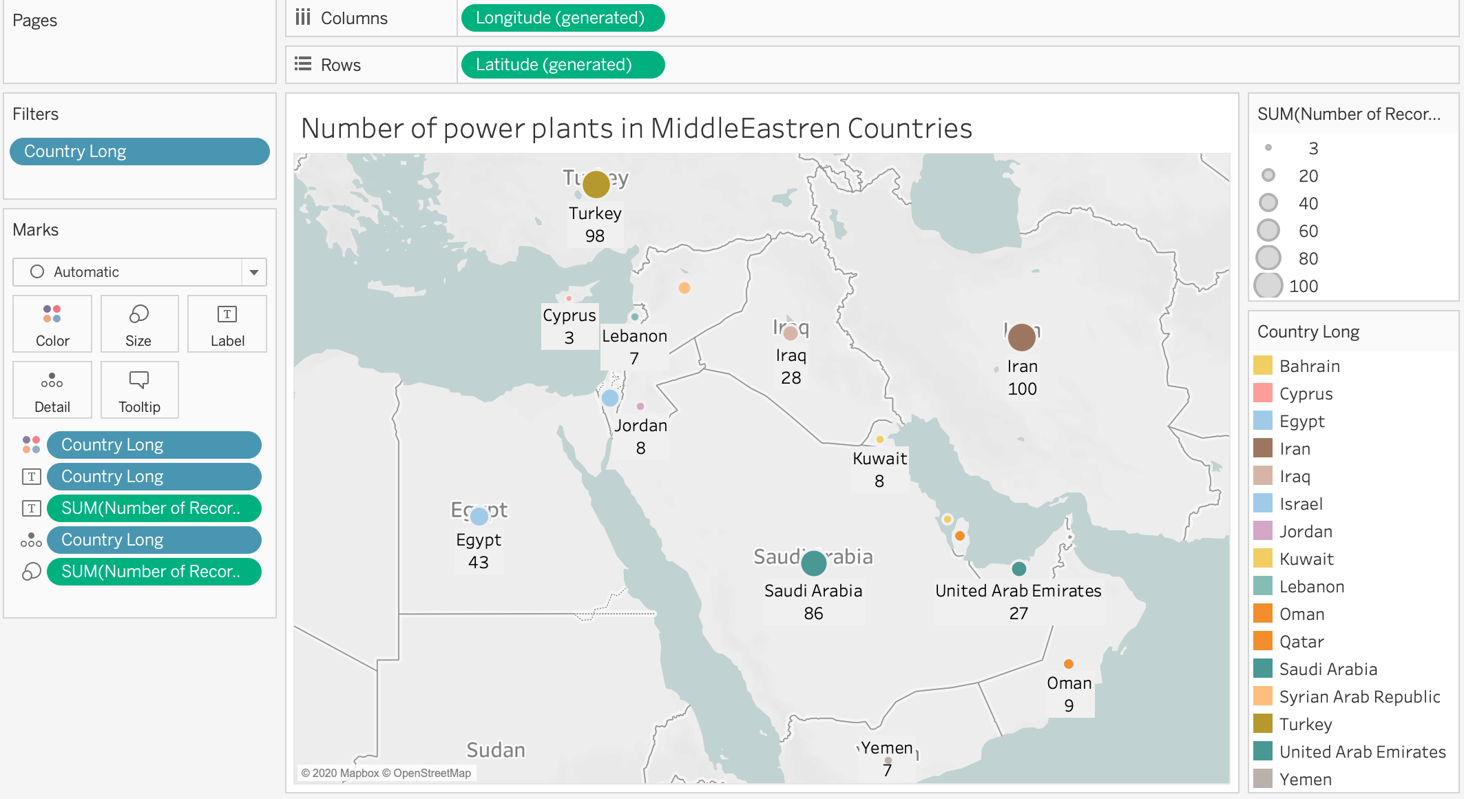
For data visualization coursework at Swansea University, I am required to create different visualization designs for the global power plant database. The image is for visualizing the number of power plants in the middle east.
Image
Reference: https://www.spglobal.com/platts/en/products-services/electric-power/world-electric-power-plants-database
Source: Global Power Plant Database - Datasets - WRI ODP
Visual Design Type: Symbol Map
Countries included: Cyprus, Lebanon, Iran, Iraq, Jordan, Syria, Israel, Bahrain, Oman, Qatar, Yemen, United Arab Emirates, Saudia Arabia, Egypt, Kuwait, Turkey
Visual Mappings:
X-axis: AVG(longitude)
Y-axs: AVG(latitude)
Detail: county name(country long)
Colour: country name(country long)
labels:number of power plant(number of records) and country name
Size:sum(number of records)
Data preparation: I used the filter to visulaize the information related to Middle east countries.
Unique observation: The number of power plants is the highest in Iran, Turkey and Saudia Arabia respectively. While Cyprus has the least number of power plants.
Does my visualization show the trends clearly? What can I improve to have better visualisation and unique observation?
Thank you in advance for any responses to this post and I’m looking forward to reading your feedback!