Guideline: Hello! As a part of my coursework, I am producing visualizations of power plants data. I am using open source power plant data set. This is one of visualizations I made. I would like to get some feedback how good is this visualization, and possible ways to improve it.
Source: Global Power Plant Database - Datasets - WRI ODP
Image
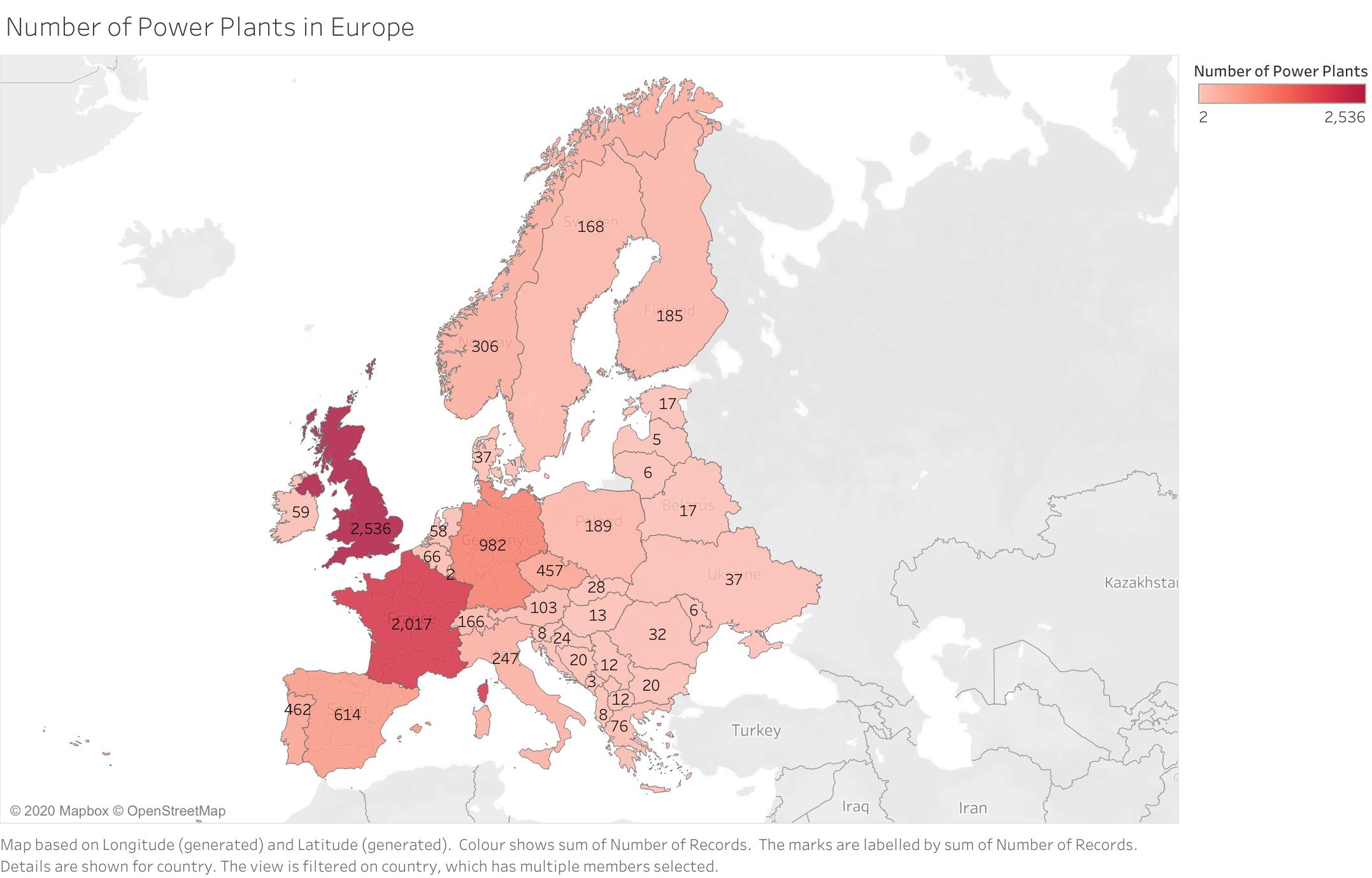
Visual design type
Map with coloured countries; colour density depends on the number power plants
Name of tool
Tableau Desktop 2019.4
Country, year
Denmark, Norway, Sweden, Finland, Estonia, Latvia, Lithuania, Belarus, Ukraine, Ireland, United Kingdom, Portugal, Spain, France, Germany, Italy, Switzerland, Poland, Czech Republic, Slovakia, Slovenia, Hungary, Moldova, Romania, Croatia, Bosnia and Herzegovina, Serbia, Bulgaria, Macedonia, Albania, Greece, Netherlands, Belgium, Austria, Luxembourg, Kosovo, Montenegro, Cape Verde. Year: 2017
Visual mappings
Map based on longitude and latitude. Colour highlights the countries; colour saturation depends on the number of power plants in particular country. The numbers on each country shows the number of power plants located there.
Unique observation
This visualization shows the amount of power plants in European countries. Top 3 countries with most power plants are – United Kingdom, France and Germany. Other countries have relatively small number of power plants. In Eastern part of Europe, number of Power Plants is relatively small compared to the Western part of Europe. Somewhere the difference in number of power plants reaches 10-15 times less power plants.
Data preparation
To produce this visualization, no data preparation is needed.
Question:
Does my visualization makes sense?
How my visualization can be improved?
Are there any other types of visual layouts that would be better for this challenge?
In advance, thank you!