Question:
I recently studied the economic complexity of various countries as part of a research project in the field of commodity trading. Inevitably, this led me to the beautiful collection of economic visualizations provided by the Observatory of Economic Complexity. I was particularly interested in the following single-view network map, which visualizes a country’s economic complexity in product space (What are the most specialized products of Switzerland? (2017) | The Observatory of Economic Complexity).
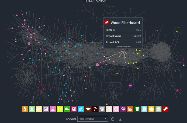
The strip of icons at the bottom allows users to hide or isolate nodes (products) by product category, thus satisfying the focus + context interaction technique (since the icons of omitted categories are greyed out, but still shown). The visualization also supports zooming/panning to explore the network structure, while hovering on a single product class reveals a summary tooltip.
Despite these wonderful features, I couldn’t help but notice (1) the occlusion/indistinguishability of multiple arcs and (2) unintuitive node positioning. I came up with the idea of aggregating products to clusters for each category, then revealing individual products/arcs only when zooming in, i.e. using a flow map for overview, then switching to a network map when the user wishes to explore details.
Perhaps other users have had similar experiences with network maps and wish to share their approaches/choice of guidelines?