Multiple colour encodings for countries in a choropleth map

Question:
I’m working on a visualisation that aims to find interesting patterns and trends in a world power plant data set, which contains all manner of statistics and production figures on the plants. As part of this, I have chosen to draw a choropleth map of the world in order to illustrate the most used power sources globally.

The problem is that I’m starting to doubt my use of visual encodings - specifically the hue and saturation of the countries. Here’s where I am so far:

Name of Tool: Altair
Dataset: Global Power Plant Database
Country: Worldwide
Year: 2014
Visual Mappings:

  • The hue of a country represents its main fuel type; the fuel type it uses
    to generate the most electricity.
  • The luminance of a country represents the amount of electricity it produces
    across all fuel types. It is banded into five discrete values along an exponential scale.
  • Tooltips are used to offer detail-on-demand to the user, showing precise information
    about a country’s electricity production. (so just imagine tooltips :smiley_cat:)

Output:


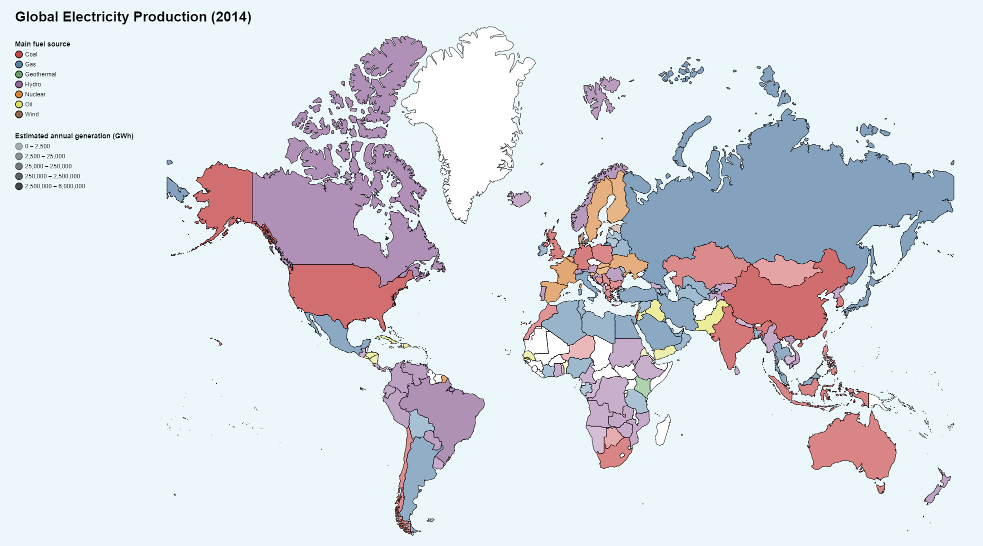
My issue is with the user’s ability to compare the quantitative values between countries, and especially those of different categories, as it seems to be difficult to determine saturation despite using a perceptually uniform colour set.

I’ve looked at some literature on the matter, and Ward, Grinstein, & Keim state that the combination of saturation and hue for encoding can only really provide a capacity of ~13 discrete values, where my visualisation incorporates 7 (hue) x 5 (saturation) = 30 values. Additionally, Munzner’s channel rankings for ordered attributes summarises that colour saturation is perceived fairly weakly.

I’m finding it difficult to choose a different encoding for the quantity, as others appear unsuited for use on a map (position, length, tilt, area). How could I improve this this and make comparisons easier? Should I change it at all?!

Hopefully someone can give me a different perspective on the issue. Thanks for reading!

[Ward, Grinstein, & Keim/Halsey & Chapanis] - Ward, Grinstein, Keim. (2015). Interactive Data Visualization: Foundations, Techniques, and Applications [p. 129]
[Munzner] - Munzner, T. (2015). Visualization Analysis and Design [pp. 102-103]

P.S. I couldn’t edit my post so I’ve had to repost the post :crying_cat_face:

As you point out the luminance difference – to visualize the estimated annual generation (GWh) – is in my opinion as well too small, to easily distinguish between the different categories. This is especially the case when many colors are present because some special effects occur in these choropleth maps, for example, colors of a country might be perceived differently, depending on the colors they are surrounded by (Brewer, 1997).

To improve this issue there are probably several approaches that could be explored. In the end, what should be achieved is to increase the contrast between the different color shades, to make it easier to distinguish between the different values. I would like to point to some ideas that could help in this situation:

o First absolute GWh generation is connected to a country’s population size and to some extent to the country’s area. This variable is therefore already captured partially by the representation of the countries through the map (and to some extent the user will probably know as well, what countries have the highest population numbers). At the moment the visualization would probably look similar when the population would be represented by the luminance. (xkcd: Heatmap)
The variable could be changed to estimated annual generation (GWh) per capita. This would probably help to increase the contrast between the countries and increase the information quality of the visualization as well.

o Another approach is to use a spectral color scheme to create bigger contrasts (Brewer et al, 1997). And represent the ordinal variable of the main fuel source with another visual variable. For example, a small glyph or a colored point. This could be combined with the idea above (use estimated annual generation (GWh) per capita).

o As described by Andrienko, Andrienko, and Savinov (2001), another aspect that should be taken into consideration when creating categories in a choropleth map is the definition of the data classes (for estimated annual generation). Different classification borders can lead to big differences in the visualization. One completely different method would be to create the categories in a dynamic and interactive way. For example, the user could manipulate the category’s boundaries with an interactive slider.

o Another idea could be to create a cartogram, where the area of the country is adjusted depending on the estimated annual generation (GWh). There are a lot of different technics to generate a cartogram. A helpful overview is provided by Nusrat and Kobourov (2016). One thing that has to be considered is for example that the resulting and distorted map still provides some meaningful abstract picture of the shapes that countries can be identified.

o Also, looking at the number of data classes again might be necessary. As mentioned by Harrower and Brewer (2003) more data classes increase the information that is represented through the map. The downside of more data classes is that the contrast between the different data classes is lower. This makes it more difficult to distinguish between the different countries. Thus, reducing the number of data classes could help as well. If that is an option depends on the idea and message that should be communicated with the visualization. One interesting tool to play around with different color schemes is this site: ColorBrewer: Color Advice for Maps
There it is possible to evaluate different types of color schemes and different numbers of data classes on a specially curated map.

I hope some of these thoughts and sources help you to improve your visualization.

Sources:
Andrienko, G., Andrienko, N., & Savinov, A. (2001, August). Choropleth maps: classification revisited. In Proceedings ica (pp. 1209-1219).
Brewer, C. A. (1997). Evaluation of a model for predicting simultaneous contrast on color maps. The Professional Geographer, 49(3), 280-294.
Brewer, C. A., MacEachren, A. M., Pickle, L. W., & Herrmann, D. (1997). Mapping mortality: Evaluating color schemes for choropleth maps. Annals of the Association of American Geographers, 87(3), 411-438.
Harrower, M., & Brewer, C. A. (2003). ColorBrewer. org: an online tool for selecting colour schemes for maps. The Cartographic Journal, 40(1), 27-37.
Nusrat, S., & Kobourov, S. (2016, June). The state of the art in cartograms. In Computer Graphics Forum (Vol. 35, No. 3, pp. 619-642).