
Hi, I am making this post as part of a visualisation coursework and am wondering if I can get some feedback on this visualisation.
Visual Design Type: Digital Map
Name of Tool: Tableau
Country: European countries
Year: All years
Visual Mappings:
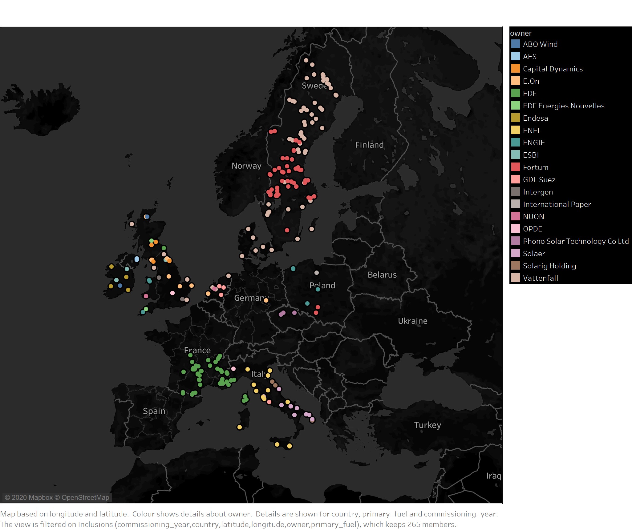
In this visualisation, the longitude and latitude of the power plants are used to draw points on the map. Colour is used to identify the owner of the power plants. I found that a black background helped me differentiate the colours more easily than a white background.
Unique Observation:
This visualisation allows the viewer to spot power plants that are owned by companies which have power plants in more than one country. For example, the company E.On has powerplants throughout the UK, but also in the Netherlands and Germany. Another example is Vattenfall, who have powerplants in the UK, Netherlands, Sweden and Denmark.
Data Preparation:
Microsoft Access was used in conjunction with SQL to query the data to find owners with powerplants in at least two countries. All powerplants that are owned by these owners are then visualised. Some of the data was also modified such as the owner name ‘100% Vattenfall’, which was replaced with ‘Vattenfall’.
Dataset: http://datasets.wri.org/dataset/globalpowerplantdatabase
Questions:
- Is it easy to identify countries that a company has a power plant in?
- Is a digital map appropriate to present this information?
- Are there too many or too few data points?
Thanks!