
Hi everyone,
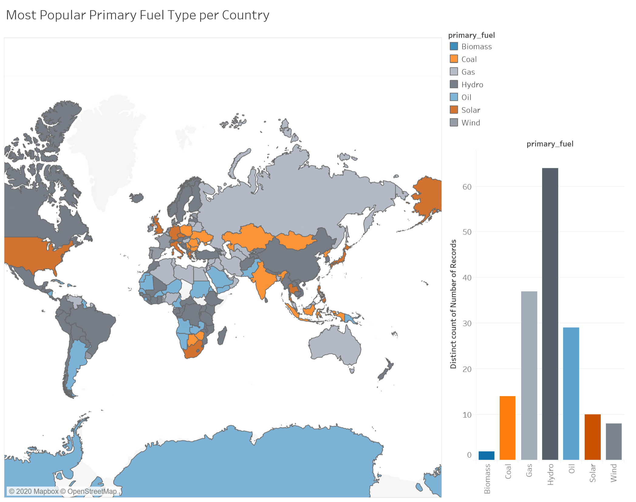
I have created a visualization that shows the most popular primary fuel type for power plants for each country around the world. I wanted to create a visualization which is more geared towards a general audience. I have opted with the design below and would very much appreciate some feedback.
Guideline:
Visual Design Type: Multiple Views, Digital Map, Bar Chart
Name of Tool: Tableau
Country: All ( Not Including: Chad, South Sudan, Suriname, Haiti, Somalia, Falkland Islands, Greenland and Svalbard).
Year: All Years.
Visual Mappings:
Digital Map:
Colour: The colour channel is mapped to the ‘primary_fuel’ attribute. As the data here is qualitative, hue is used to allow for easy differentiation between the fuel types. Tableau’s colour-blind safe pallet is used to ensure maximum readability.
Shape: Each shape is mapped to its related country, from the ‘country_long’ attribute.
Bar Chart:
X Axis: The X-Axis is mapped to the
Y Axis: The number of distinct records counted.
Colour: As with the digital map, the colour channel is for the bar chart is also mapped to each of the primary fuel types, allowing for easy comparisons between the two views.
Size: The size of each bar is mapped to the number of countries in which the given fuel is most numerous.
Unique Observations:
From this observation, it is immediately obvious that Hydro is the most popular primary fuel type per country by a significant margin. A second observation would be that countries typically associated with lower GDP tend to rely more heavily on non-renewable primary fuels such as coal, oil and gas. This is observation is not always true, especially with the abundance of hydro as a main primary fuel.
Data Preparations:
Some countries were not included in the original data set, these were ignored.
Data Source:
Questions:
- Does this visualization clearly help answer the question?
- I am aware that 7+ colours for visualization can result in readability issues and I am on the limit in this case, is there anything I could do to help in this case?
- I am also not entirely pleased with how some countries within this visualization tend to get lost due to their size, are there any additions I could make in order to aid this?
- Are there any other improvements that I could make to this visualization overall?
Thank you.