Hello all,
I am a Swansea University student looking for some feedback on a visualisation I have created for my data visualisation module. This visualisation shows a heatmap of the number of power plants that use the combination of primary and secondary fuel types.
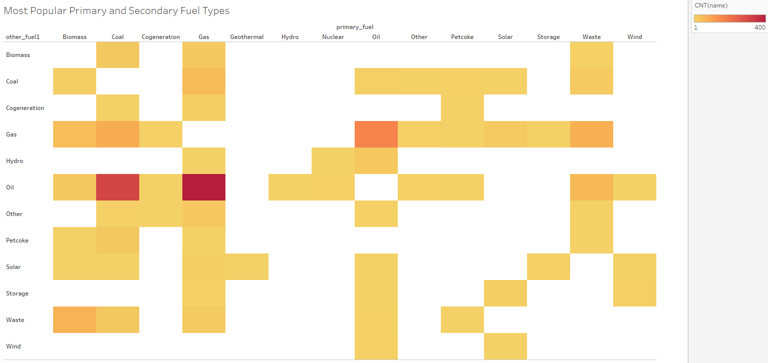
Source: Global Power Plant Database - Datasets - WRI ODP
Tools: Tableau
Data Visualisation Type: Heatmap
X-Axis: primary_fuel
Y-Axis: Other_fuel1
Visual Mappings: CNT(name)
Unique Observations:
- Gas the most Primary fuel used in conjunction with a secondary fuel type.
- Oil is the most common secondary fuel type.
- Gas and oil are used in conjunction with one another more than any other fuel type.
Data Preperation:
Data is unaltered from original data set.
Questions::
- Is the visualisation effective at displaying the most commonly used pairs of fuel.
- Are the colours used effective at showing differences in count?
- What do you learn from the visualisation?