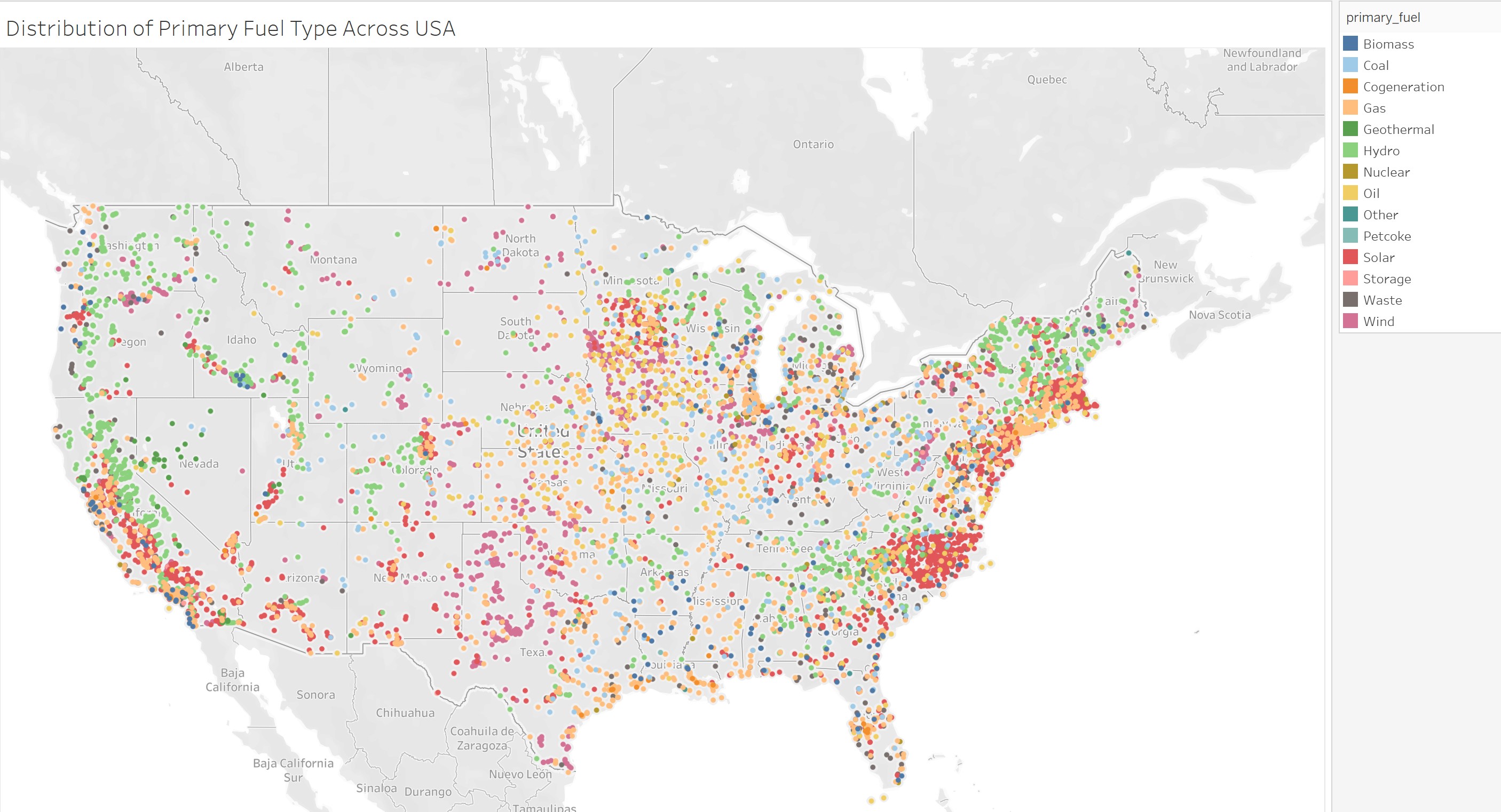
Visual Design: Symbol Map
Name of Tool: Tableau
Country: USA
Year: All years used in the dataset
Visual Mappings:
X-Axis: Latitude
Y-Axis: Longitude
Colour: Primary fuel
Unique Observation: This shows how primary fuels vary in distribution across the USA. Hydro and Solar clusters around coastal areas whereas coal clusters inland. In general, primary fuels tend to cluster together with the same types.
Data Preparation: Data was cleaned to avoid null values.
Dataset: Global Power Plant Database - Datasets - WRI ODP
Questions:
Does my visual design present the information well?
Are the circle sizes a good balance between showing the location on the map and conveying the primary fuel type?
Should the size of the circles indicate another measurement?