Hi, I’m doing a visualization of global power generation, and I have a case to share with you
Visual Design Type: Digital map & heat map t & bar char& bubble chart
Name of Tool: Tableau
Country: World
Year: 2017
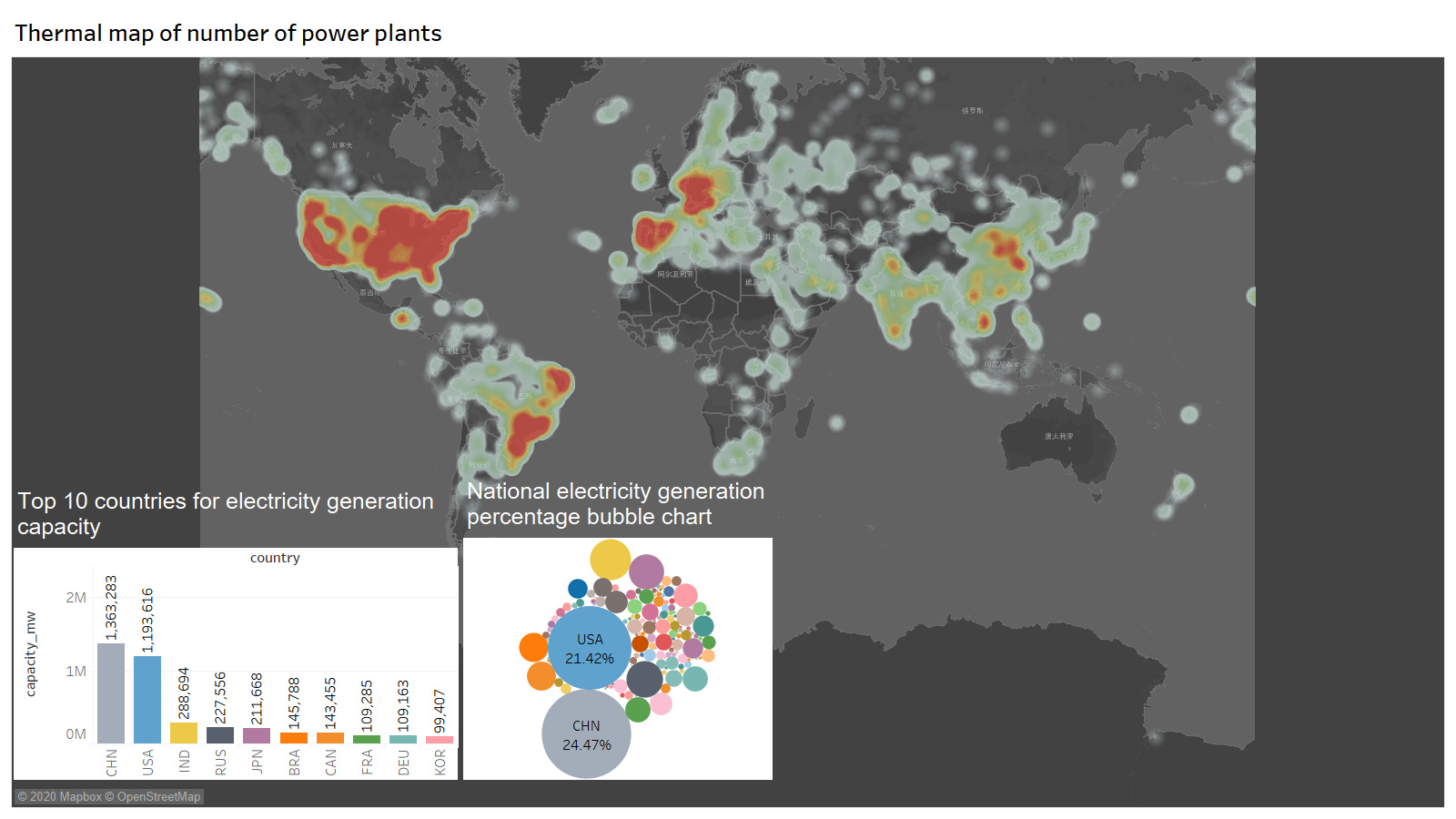
Visual Mappings: In this design, the heat intensity on the map represents the number and density of power plants. The redder the color, the denser the power plant. The bar chart at the bottom left shows the productivity of the top ten countries. The horizontal axis represents countries, and the vertical axis represents productivity. The bubble chart on the right shows the size and proportion of productivity in different countries. The greater the productivity, the larger the corresponding bubble. Users can hover over the map to see the name and productivity of any power plant. When the user hovers over the bubble diagram or column diagram with the mouse, they will find that the two graphs have some interactivity. When one graph is selected, the other graph also displays the corresponding country data.
Unique Observation: What can be found is that China and the United States are among the most productive countries in the world. But the heat map shows that the density of power plants in the United States is significantly higher than in China. But the bar chart shows that China’s productivity is stronger than America’s. This is an interesting direction。
Data Preparation: The year’s blank data was removed. The bar chart has screened the top ten productive countries. And color coded each country.
Question: Can such visualizations visually reflect the data to the user?Is there any plan that can be modified?