First time posting to this forum and am thankful in advance to any advice given in response relating to the reading of this post.
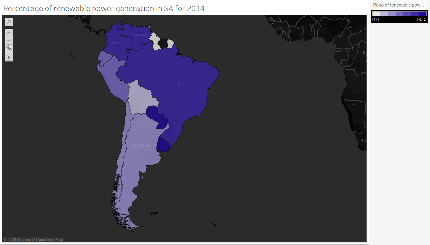
For a data visualization coursework at Swansea University, I am tasked with creating various visualizations of the global power plant database as is linked below. The visualization with which this post is concerned with is for displaying the percentage of renewable energy generation in South America with respect to each country.
Image:
Reference: https://www.spglobal.com/platts/en/products-services/electric-power/world-electric-power-plants-database
Source: Global Power Plant Database - Datasets - WRI ODP
Visual Design Type: Symbol Map / Colour Indicative Map
Tool used: Tableau
Countries included: Venezuela, Brazil, Peru, Argentina, Bolivia, Chile, Paraguay, Columbia, Guyana, French Guiana, Ecuador, Uruguay
Year: 2014
Visual Mappings:
X-axis: AVG(longitude)
Y-axs: AVG(latitude)
Detail: county_long (full name of a country)
Colour: AGG(Ratio of renewable power generation)
Data preparation: In order to find the percentage of generated renewable energy in a county, I first had to split the primary fuel types in two sets, Renewable and Non-renewable. From this I could calculate for each country, the ratio of renewable to non-renewable power stations.
The ratio was calculated as so and can be applied to each country: formula = IF [Renewables] THEN 1 ELSE 0 END. This checks if a primary fuel is in the set Renewables and returns 1 if it is, or a zero if it is not.
By calculating the ratio of renewable power stations: the following formula could be applied to find the percentage of renewable power generated in each country: formula = (SUM([[Ratio of fuel types]]]*[estimated_generation_gwh]) / SUM([estimated_generation_gwh])) * 100
Unique observation: From the data it is surprising to me at least how renewable driven most of South America is given policies relating to deforestation etc. in the region and it would be interesting further-more to break down the generation into the separate renewable fuels, where hydro is the most power generating.
Questions:
Given the information provided and the context of the data, I wish to ask, does the visualization presented represent the trends clearly and if not, what would be a more optimal way of displaying the data. Along with this, are all of the axis and title named well to reflect the display?
As well as this, are the colour hues chosen appropriate for the visualization, especially in relation to those that are colour blind? I have chosen to segment the colour scale since colour blind people can still recognise hue changes very well and so it seemed appropriate in this case without affecting the display for those that are not colorblind.
Thank you in advance for any responses to this post and I’m looking forward to reading your feedback!