Welcome,
For my data visualization assignment at Swansea University, I am assigned to produce various data visualizations involving the global power plant database.
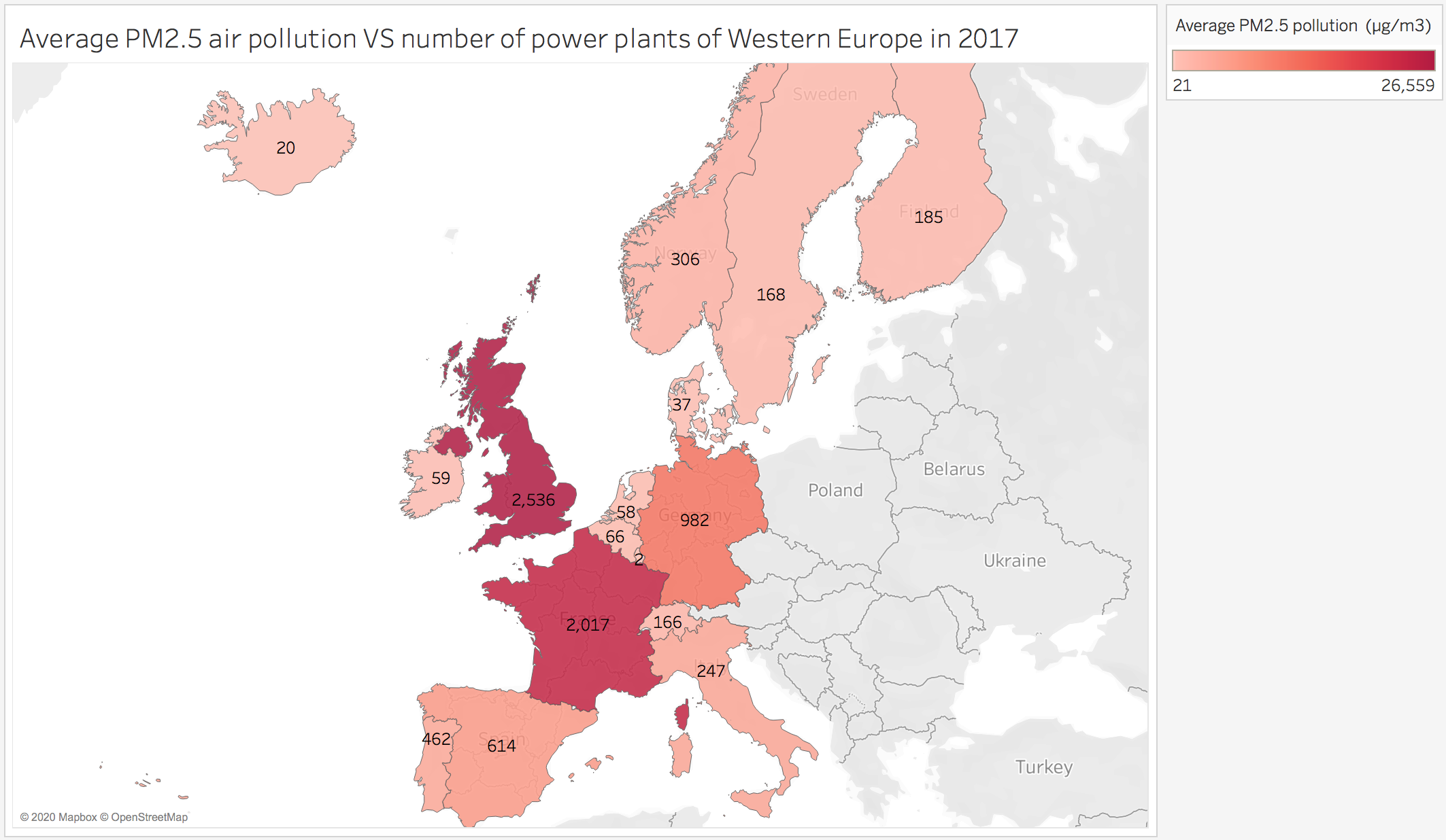
The visualization below shows a map of Western Europe that displays the number of power plants compared to the average PM2.5 air pollution in each country in 2017.
Image:
Source:
http://datasets.wri.org/dataset/globalpowerplantdatabase
Visual Design Type: Colour Indicative Map
Name of Tool: Tableau
Countries involved: Belgium, Denmark, Finland, France, Germany, Iceland, Ireland, Italy, Luxembourg, Netherlands, Norway, Portugal, Spain, Sweden, Switzerland, United Kingdom
Year: 2017
Visual Mapping:
X-axis: Longitude
Y-axis: Latitude
Number Labels: Number of power plants
Detail: Country name
Colour: Average PM2.5 air pollution (ug/m3)
Data Preparation:
I used two different data sources, one for all power plants in each country and one for the average PM2.5 air pollution in each country. Therefore I had to unify both data sources together based on the country names so that I can show the number of power plants and air pollution of each country on the map.
Unique Observation:
The map shows that the UK and France both have an extremely high number of power plants and the highest air pollution compared to the other countries.
Germany has a moderate amount of power plants and has relatively cleaner air than the UK and France.
The rest of the countries within Western Europe have even fewer numbers of power plants and much cleaner air.
A growing trend can be seen where the more power plants there are in a country, the average amount of air pollution will become higher.
Questions:
-
Does the visualization clearly show the data and trend?
-
Can the visualization be changed or improved to show the data more accurately?
-
Is the colour choice suitable for this visualization?