Hello,
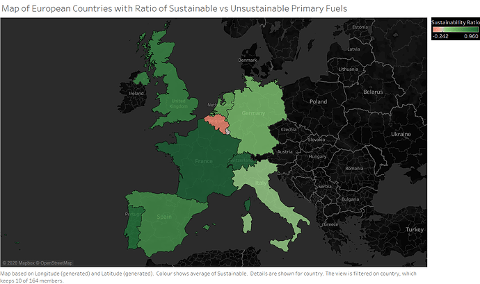
I am a Swansea University Student and I have been asked to produce a visualization of the global power plant dataset, below is one of my visualizations.
Image:
Source: Global Power Plant Database - Datasets - WRI ODP
Visual Design Type: Symbol Map
Name of Tool: Tableau
Country: United Kingdom, France, Germany, Spain, Portugal, Luxembourg, Belgium, Italy, Netherlands
Year: 2019
Visual Mappings:
* X-Axis: Latitude (Generated)
* Y-Axis: Longitude (Generated)
* Detail: Country
* Colour: AVG(Sustainable)
Unique Observation: Belgium and Luxembourg have the worst sustainability ratios when compared with the other countries, France has the highest.
Data Preparation: Calculated field added called Sustainable to determine if primary fuel of power plant is sustainable. Formula = (IF [primary_fuel] = “Hydro” OR [primary_fuel] = “Biomass” OR [primary_fuel] = “Wind” OR [primary_fuel] = “Solar” THEN 1 ELSE -1 END)
Questions:
- Does the legend and title make it clear what the visualization is showing?
- Is the scale for sustainability suitable? Scale is (-1 to 1).
- Would there be another map visualization type more suitable?
Thank you for reading.
