Visual DesignType: The mean capacity of different type pf different continent
Name of Tool: Tableau
Country: All of the countries in the dataset
Year: All of the years in the dataset
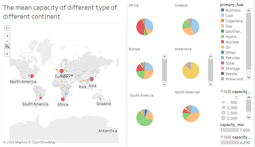
Visual Mappings: This visualization consists of a topographic map and six pie charts. In the topographic map, according to the six previously divided continental plates, each plate depends on the form of energy power generation. Different colors represent different types of energy. The size of the circle indicates different capacity. The larger the circle, the more capacity. Six pie charts represent different types of energy on different continental plates.
Unique Observation: As can be seen from the first figure, most of the continental plates rely on nuclear power and coal for power generation. It can be seen from the six pie charts that Africa mainly relies on nuclear power generation, Oceania mainly relies on coal for power generation, Europe mainly relies on natural gas for power generation, Oceania mainly relies on oil for power generation, South America mainly relies on geothermal energy for power generation, and North America mainly relies on natural gas for power generation.
Data Preparation: Different countries are classified according to their different continental plates. Then visualize their corresponding data.
question:
• Does my visual design make sense?
• Is my choice of color map optimal?
• How can my visual design be improved?
I think this design is very good. The information on the map is related to the information on the pie chart. I can see clearly on the pie chart the type and proportion of energy generation used in each state.
I think this design is very good. The information on the map is related to the information on the pie chart. I can see clearly on the pie chart the type and proportion of energy generation used in each state.
First of all, I really like your design. The plates in the world map that show the different sources of energy generation are a great idea to supplement your pie charts. Your visualization is pre-attentive: with only one glance, one can gather information about which continents rely on which power generation in comparison to the other kind of power generation. It also maps it more accurately geographically than in the pie charts, for example with Europe, in the pie chart it does not say where in Europe but in the world map one can see where approximately, which gives a new insight.
In my opinion, your choice for the color map is suitable. Although we have different colors in mind when hearing about different energy generators, like black for coal, yellow for solar, or green for biomass, a qualitative color palette makes sense with this many primary fuel sources. With the world map that shows the continents in a light grey, you reduced the chart junk and made the focus be on the plates and not on the map itself. There are many different primary fuel generators, which makes it hard to choose different colors that are distinctive enough to be able to read the pie charts. In your color map, one can distinguish the different colors. The only thing I would change here is that the grey color is mapped to “Wave and …” instead of to the category “Other”. As far as I know, grey is mostly mapped to the category “Others” or undefined data.
The circles that signify the capacity through the area of the circles are difficult to compare, especially throughout the whole map, for example, which continent uses the most nuclear energy. William S. Cleveland and Robert McGill have written about this in their book Graphical Perception. If the visualization was interactive, it could show the capacity value when hovering over a plate, so the user does not have to solely rely on their perception. Also, an interactive visualization would allow the user to explore the data by themselves, for example by letting the user choose which primary fuel categories they want to look at. Another point that could be improved is that Asia and Europe are named twice on the world map. This probably confuses the user and makes the visualization more difficult to understand at first glance since there is more chart junk than necessary and the data-ink ratio decreases.
I hope you find my feedback helpful.
P.S. I would have linked some interesting websites related to chart junk and data-ink ratio but since I’m a new user, i can only have two links in my reply. Hopefully, this is not too much of an inconvenience.
I like how you combined the map with the pie charts. It gives a good overall feel for how energy types differ by continent. The color palette looks quite balanced too, though maybe some of the tones (like the reds and oranges) could be a bit too close for quick visual distinction.
One small thing that might make it easier to read is to simplify the map side a bit. Right now, both the circles and pie charts are carrying a lot of information, so maybe one could focus more on capacity and the other just on composition, but yeah that is just an opinion.
Overall, it’s a nice use of Tableau for summarizing global data like this. Good work!