
Hi all,
My name’s Pete, and I’m a Swansea student who’s made a data visualisation of the location, fuel type and estimated energy generated by each power plant in the Republic of Ireland. I had a few questions regarding my visualisation, in terms of how to develop it further.
Thanks in advance
Image :
Dataset Source: http://datasets.wri.org/dataset/globalpowerplantdatabase
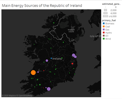
Visual Design Type : Symbol Map
Name of Tool : Tableau Desktop
Country : Republic of Ireland
Year : 2014
Visual Mappings :
- Colour – primary_fuel
- Shape – Circle
- Size – estimated_generation_gwh , which has been scaled up to make it easier to see all values, including the lower-producing wind farms.
Unique Observation : While the most common type of power plant in the Republic is wind-power, the largest single plants, in terms of estimated capacity, appear to be gas and coal-powered, and appear to be located in the top three major urban areas of the country, i.e. Dublin, Cork and Limerick. Overall, fossil fuels appear to be responsible at least a sizeable amount of, if not the majority, of the Republic’s energy output.
Data Preparation :
- Filtered out all countries apart from the Republic of Ireland.
- Increased the size scale of the circles, to make it clearer to read
- Darkened base layer of map, in order to make the size and location of the circles clearer.
Questions:
- Is my visualisation readable, and does it make sense?
- Is my choice of colour map optimal?
- Is there a type of graph that would be better suited for this type of visualisation?