Data Set: Global Power Plant Database - Datasets - WRI ODP
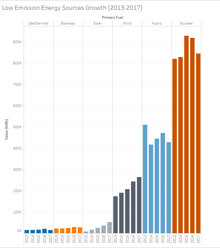
Visual Design Type: Side-By-Side Bars
Name of Tool: Tableau
Country: All
Years: 2013-2017
Visual Mappings: Columns represent low emision fuel types, with the GWh generation through 2013-2017 nestled under their respective fuel type. Each colour represents a different fuel type.
Unique Observations: We can see that wind, hydro, and nuclear fuel types produced the most GWh from 2013-2017. However, there is a downward trend in wind and nuclear energy production, possibly signifying even a further downward trend for these types. Wind and solar on the other hand show an increase in usage.
Data Preparation: Fuel types are filtered to include only low emission sources.
Question: Is this an effective way to show the trends overtime of the demand for clean energy sources? Can things such as colour and the overall look of the graph be improved upon?
Thanks very much for taking the time to look at my graph, and for any feedback you may have!