Hey,
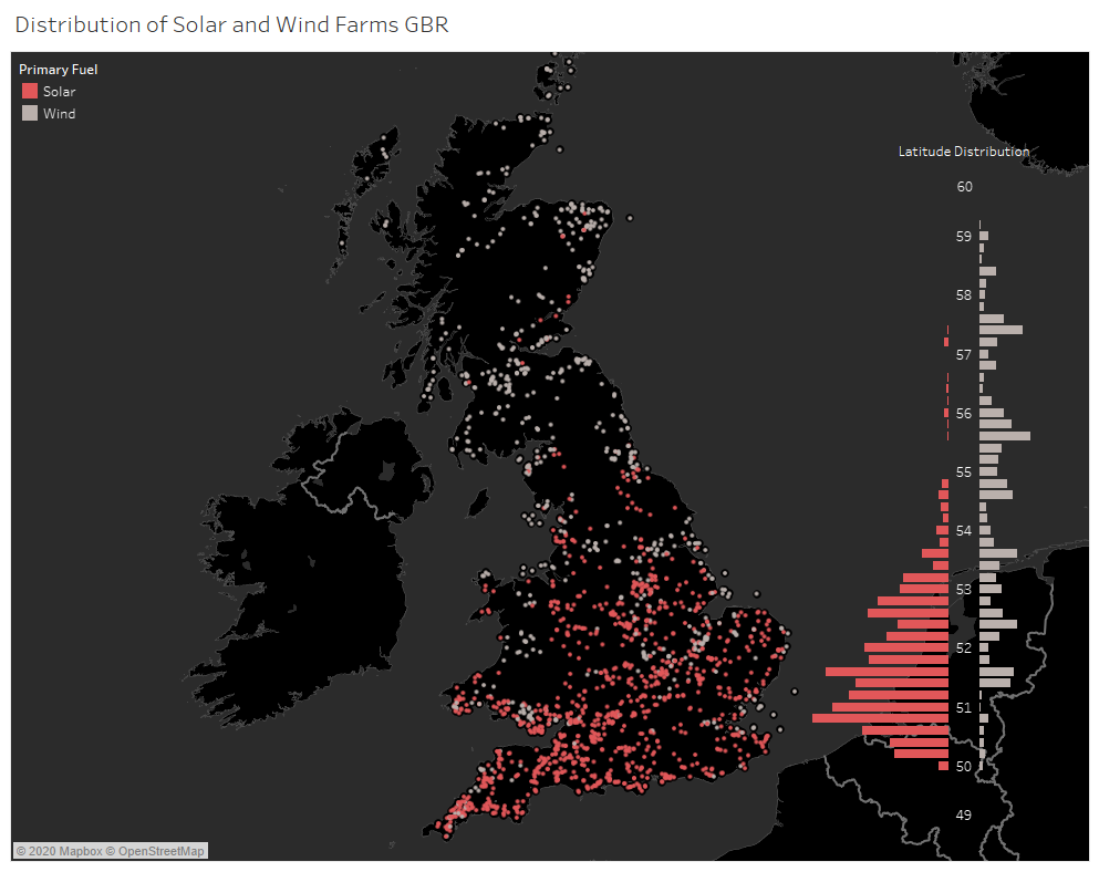
I have created a visualisation in an attempt to show the distribution of solar vs wind farms in mainland Britain. The information I wish to convey is how the number of solar farms diminishes as you move further north. I’m not sure about how to show a comparison between wind vs solar in regard to latitude, so I’ve used a diverging bar-chart.
Visualisation:
Dataset Source: Global Power Plant Database - Datasets - WRI ODP
Tool: Tableau
Country: Great Britain
Year: 2018
Visual Mappings:
- Digital Map:
Colour: Primary Fuel (Wind/Solar)
X-Axis: Latitude
Y-Axis: Longitude - Diverging bar-chart
X-Axis: Latitude range (0.2)
Bar-Height: Count of represented Primary Fuel
Observation: Locations of solar farms are mostly limited to the south of Britain, whereas wind farms are mostly uniform throughout. Merely showing the locations of the farms would not be significant enough to show the quantity of the farms in a region. The diverging bar-chart helps in regard to this.
Data Preparation: Filtered to only include latitude and longitude co-ordinates in mainland Britain. Filtered fuel type to only include Wind and Solar.
Question:
Are the colours impactful enough to show the locations of the farms distinctly?
I am also not sure about the diverging bar-chart. I didn’t want to clutter the visualisation with tick-marks. Is there a better way of showing this information without causing visual clutter?
Thank you for taking the time to read ![]()