
Greetings everyone, I’m a Swansea student working on a coursework and would like some input for this visualisation.
Image:
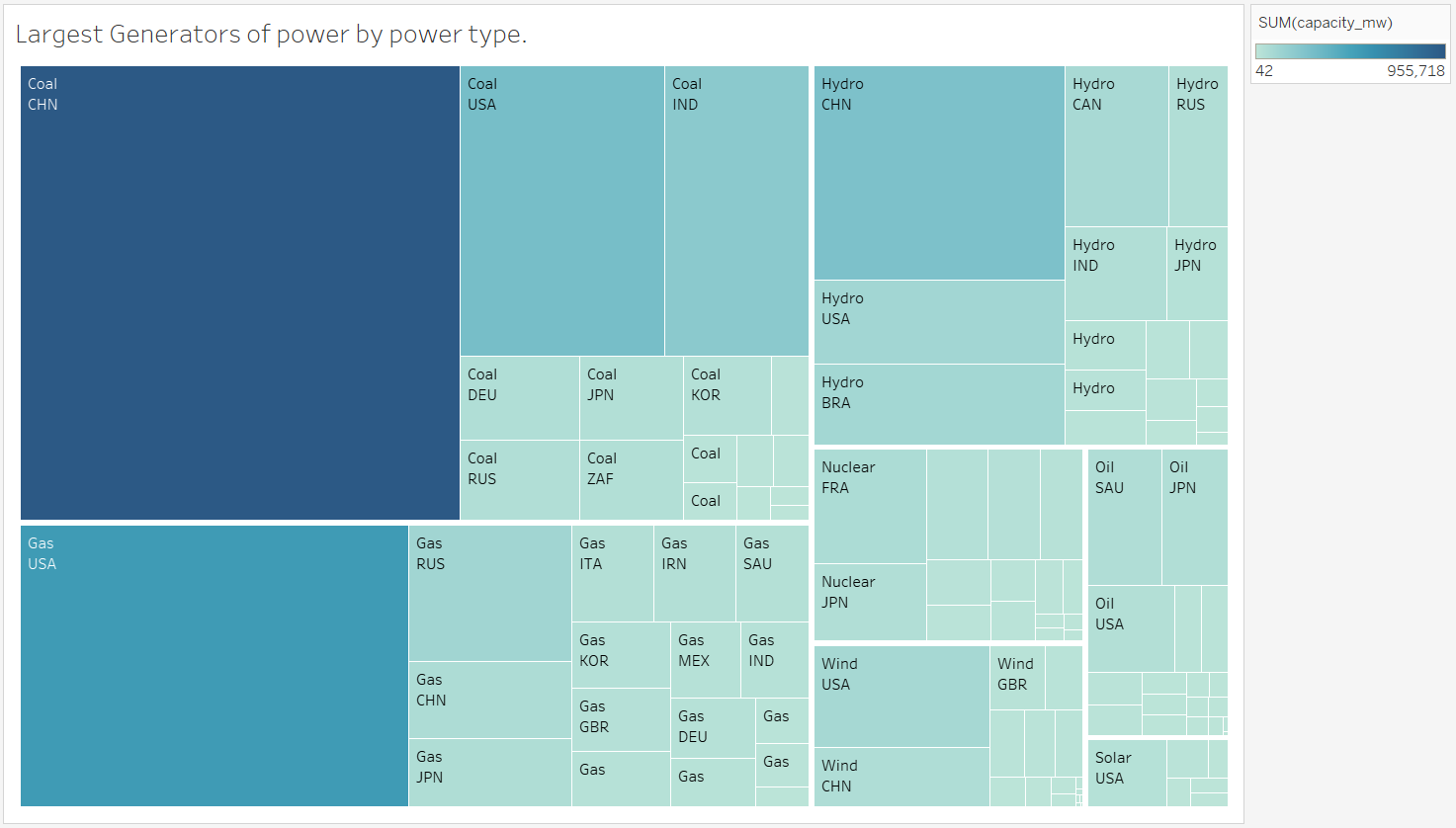
Visual design type: Treemap.
Name of tool: Tableau.
Country: Global.
Visual mapping: I use the Sum of the capacity_mw as the colour and size and the primary_fuel as the primary lable and then the country as the secondary one.
Unique Observation:: We can see that while the most power generation comes from coal and more specifically China we can see that the countries most heavily invested in unrenewable fuels also are making the largest investments into the renewable fuel infrastructure with Coal using china having a large income on power from Hydroelectric and The United States of America that are second on Coal use as well as first on Gas investing into all other major renewables other than Nuclear
Data Preparation: This visualisation excludes the least important(When it comes to capacity_mw) to improve readability and focus on the top 7 types of fuel.
Dataset: http://datasets.wri.org/dataset/globalpowerplantdatabase
Question:
I really wanted to include Solar but didn’t want to give up showing all the other types of fuels.
-
Is there a way to fix that
-
is there a way I could better represent the unrenewable/ renewable fuels, without excluding the other players. That may not have as much invested into power generation but are generating a big part of their power from, for example, Nuclear, like France.