Hi guys, I’m a Swansea University student working on of my visualisation on a global power plant database and I need some feedback on one of my visualization.
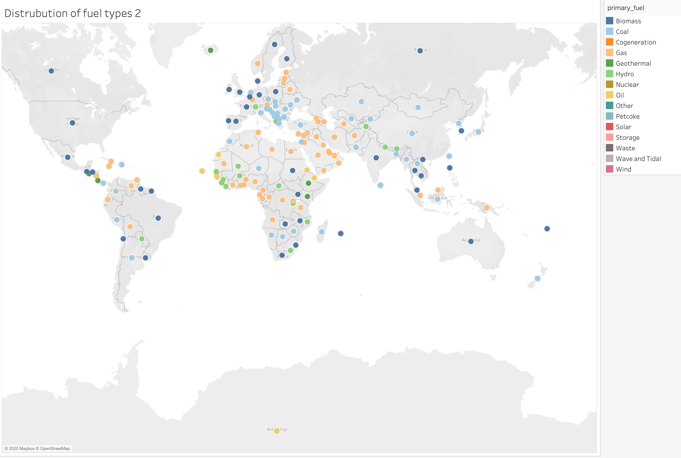
This visualization shows the distribution of fuel types.
Visual Design Type: Symbol maps
Name of Tool: Tableau
Country: All countries
Year: Null
**Visual Mappings: * colour: colour is mapped to the different fuel types, for example, Biomass colour is dark blue: ***
Unique Observation: We can see the distribution of fuel types different countries and continent, for example, you can see that coal (light blue) is the most popular type of fuel type across different continent.
Data Preparation: In order to create this data visualisation I had to get the primary_fuel and assign a colour to each of them
**Question - ** Does this visualisation make sense and how can my visual design be improved?
Thank you.