I’d like some help to understand whether or not my graph is easy to understand and whether there was anything I could do to make it any easier to read at a glance.
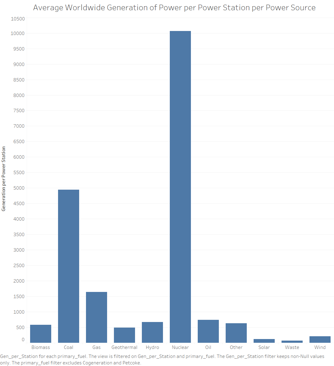
The graph is meant to show the average production of each power station per source.
Data is gathered from the global power plant database:
http://datasets.wri.org/dataset/globalpowerplantdatabase
I have created another field to complete this plot, the average generation of each power source, Generation per Power Source.