I have a question/argument about the topic of chartjunk (using extra ink in a chart, without giving any additional information through that ink). In every visualization guide I read so far, there is the opinion that chartjunk should be avoided at any moment. This is often backed up by Tufte’s data to ink ratio rule, that states the data to ink ratio should be maximized. And I understand the argument of having more difficulty in extracting the relevant information if the data to ink ratio is low. But there’s one great advantage that tends to be left out. It’s in my opinion the reason why people came up with charts like this one in the first place:
It’s attention-grabbing. Especially in modern times, we are flooded with all kinds of visualizations, where having a uniqueness factor like this, makes them stand out and therefore more interesting, and probably more memorable.
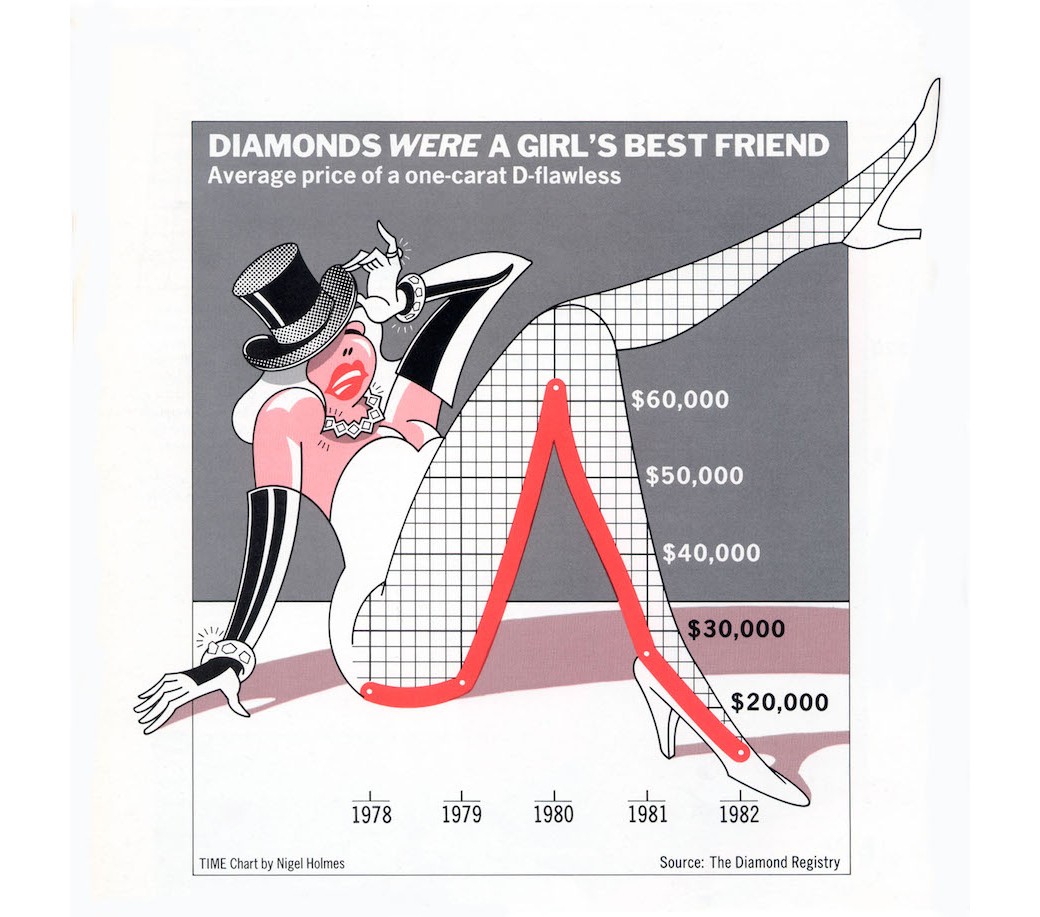
Another aspect speaking for the use of chart-junk would be the fact that, depending on the concrete visualization, there isn’t the necessity in quickly spotting detailed information. The picture I showed above, is a good example for this. It’s aim isn’t to show you how much exactly a diamond cost in the year 1979, but to show the general trend, in this case going up until 1980 and then dropping heavily later on.
And if that’s the goal of this visualization, then in my opinion, the creators of this chart did a pretty good job in achieving that.
Do you agree? And if so, shouldn’t there be an alternative word that doesn’t contain “junk” for this technique?
Source: Author: Nigel Holmes Publisher: TIME Magazine “A Gem That Lost Its Luster,” Time 120, no. 9 (August 30, 1982)
In my opinion, it depends on what the visualization is meant for. If it’s like you say for attention-grabbing, some chart chunk can help catch the interest of the intended people. But it depends on how much and if the most important points of the visualization are seen fast. If there is too much chart junk, so that you first have to find the actual data, it can be overseen in the end or maybe some people even don’t understand it. If this is the case, then the goal of the chart junk is lost, because the wrong things are emphasized.
A good paper about how chart junk can be useful is this one of Bateman and Co.: Useful Junk? The Effects of Visual Embellishment on Comprehension and Memorability of Charts
It also used your example picture.
If you don’t need to catch the attention of the target audience, chart junk should be still avoided so that the data is unrivaled the priority.
Hello everybody
I can broadly agree with both of you, but I have another thought that I think goes in the same direction as your comments. In my point of view, chartjunk is especially undesirable if you want to make certain data quickly understandable. When we look at a visualization, subconscious mechanisms are started first. If things, lets call them chartjunk, leads to disatraction and if the actual data is misinterpreted, we have missed our target. Therefore, I think that the clarity of the data is generally more important than the memorability of possibly misleading chartjunk.
I am of the opinion that ‘chart junk’ can be used effectively, although the primary focus must be the integrity of the data itself. As @Adi says, junk that detracts from the data can quickly make it difficult to understand - but in instances where the data is less important, adding superfluous imagery can be useful (e.g. infographic posters) where grabbing attention to certain facts and figures is more important.