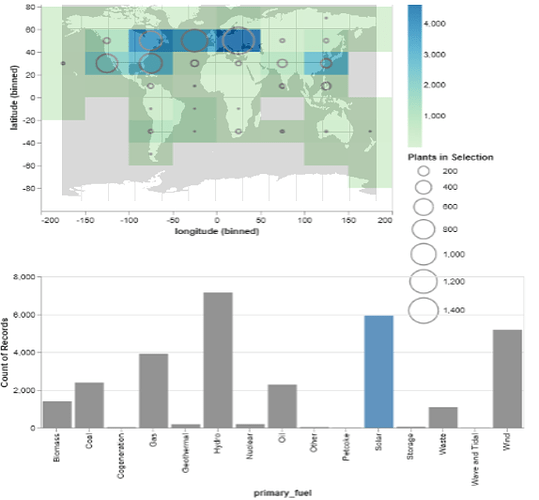
Description: I’ve been trying to find trends between the location of power plants across the world map and the primary type of fuel. I created my visualization using Altair in Jupyter Notebook. I used a Mercator for the type of map as the dataset includes latitude and longitude points for each plant. Attached is an image of my initial visualization. I’ve used the bar graph to allow a selection of a primary fuel type which will change the top chart by adjusting the rings to show how many plants of the type reside in that region. I was hoping for some help on improving my design.
Questions:
- Is this interactive design aesthetically pleasing and easy to use?
- Would there be a better visualization for what I’m trying to achieve or even a better tool than Altair that would help in improving interactivity?
- In regards to the interactivity, are there any other types of interaction that I could add that wouldn’t crowd the visualization?
