
Hello all! I am trying to show the global power station energy generation but am having issues when dealing with outliers.
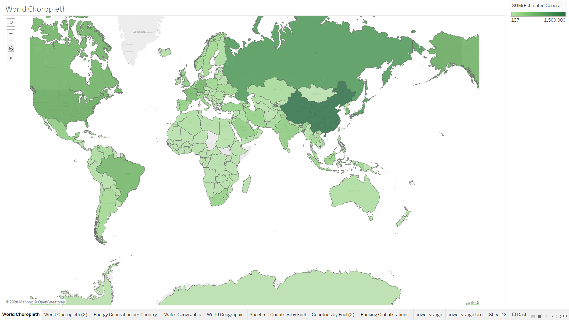
Visual Design Type: Choropleth
Name of Tool: Tableau
Country: All countries with available data
Year: All years
Visual Mappings:
X axes: Latitude
Y axes: Longitude
Colour: Energy generated
Unique Observation: China generates much more power than any other country. South America and Africa produce less power than the other continents.
Data Preparation: Colour map starts at 0 and stops at 1,500,000. This the colour mappings are spread between these values and any higher values will be shown as 1,500,000.
Source: Dataset from Global Power Plant Database, a comprehensive, global, open source database of power plants. http://datasets.wri.org/dataset/globalpowerplantdatabase
Question:
The issue Im having is that China generates so much more energy than all the other countries it is throwing off the scale. China generates over 5 million GWh of energy and the next highest is Japan with just over 1 million, and with the majority of the other countries generating significantly less than that. China sets the scale of the choropleth colours from 0 to 5 million, meaning that all countries with values under a million are hard to distinguish. To solve this issue I have stoped the colour map at 1,500,000 meaning that China will be shown as if it generated that much energy instead. Now the differences of the values for other countries can be seen, however I am worried that now the visualisation may now be misleading. Now it looks like china produces slightly more energy than the other countries and not vastly more.
Are there better methods of dealing with outliers with choropleths? Removing China from the visualistion would be another alternative but I wouldnt want to loose the observation of china producing more energy than other countries.
Thank you for your time I would love to hear anyones advice 