Hello everyone,
For a research project that I am conducting, I did some research on migration flows around the world. I’m especially interested in net migration and the effect it has on national immigration policy implications. During my research, I found this interactive visualization which is based on UN Population Division Data (https://www.un.org/en/development/desa/population/migration/data/estimates2/estimates15.asp)different countries).
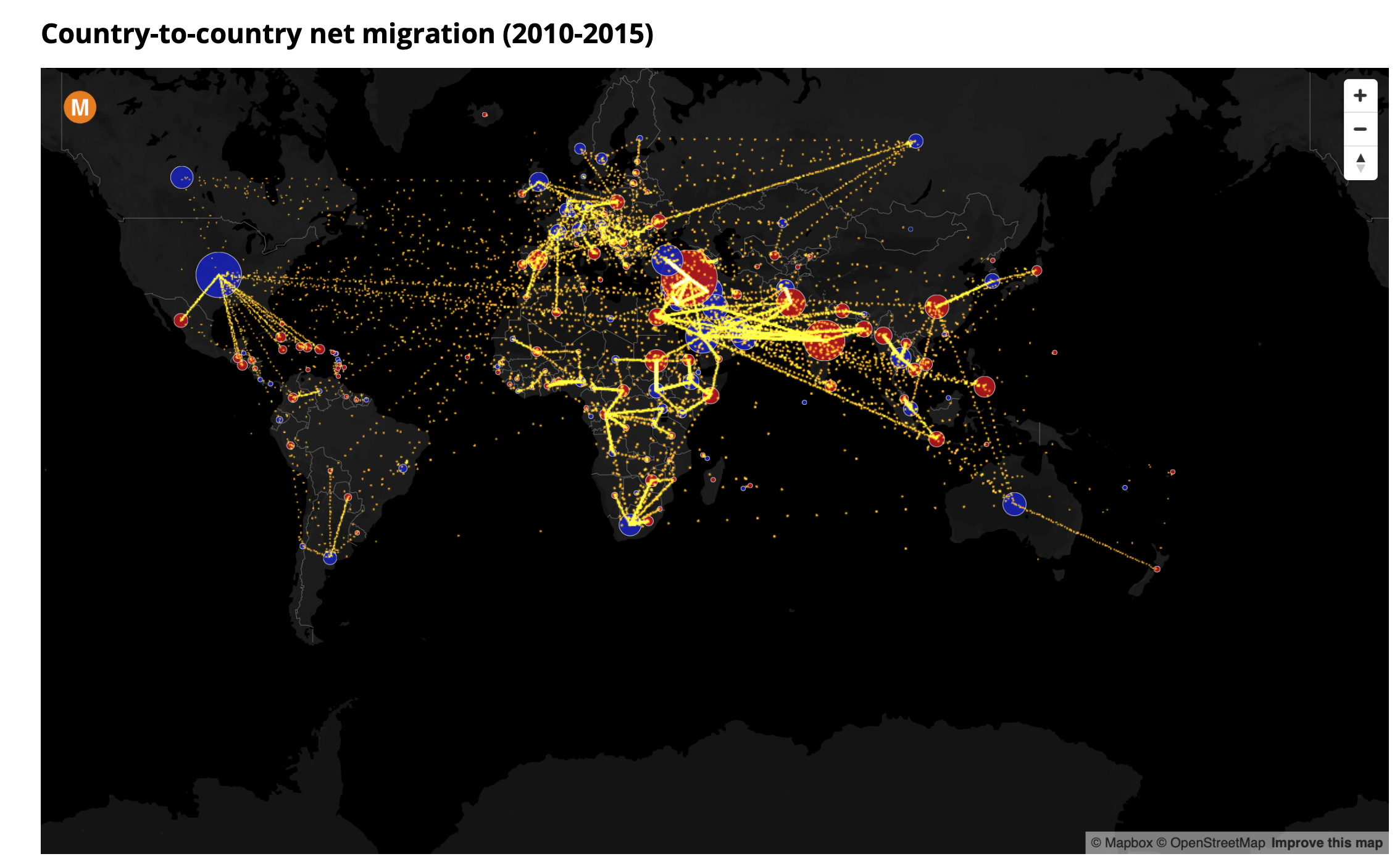
However, as can be seen in the screenshot above, it is unclear in which direction the migration flow works. I am wondering, how to cleverly translate this interactive visualization into a “still” image without any loss of information.
For instance, I am considering using pre-attentive features such as shape, position and coloring to visually group data. In addition, being aware of some Gestalt principles such as common fate or continuity could be a solution. Is this a good approach or are there any other principles/ideas to consider?
I am quite new to this field and I am not sure what other techniques or tools are available for the implementation of this task. What software are available and appropriate for this challenge? I would be very grateful for any suggestions and advice.
Link to interactive visualization: http://metrocosm.com/global-immigration-map/
Thank you very much!
Emilia