Hello, I am a student as Swansea University and I have been given the task of creating data visualizations for the global power plant database (GPPD). Global Power Plant Database - Datasets - WRI ODP
I’d like to know how can my visual design be improved? or Any other ways that I could visualize the distribution of renewable energy fuel sources across Great Britain?
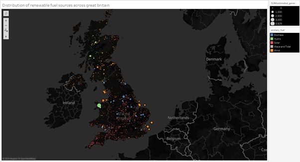
Image:
Visual Design Type:
Symbol Maps
[1] Proportional symbol maps visualize numerical data associated with point locations by placing a scaled symbol—typically an opaque disk or square—at the corresponding point on a map. The area of each symbol is proportional to the numerical value associated with its location.
Name of Tool:
Tableau
Country:
Great Britain
Year:
2014
Visual Mappings:
Colour – Primary Fuel
Size – SUM (Estimated_generation_GWH)
Detail – Country
Detail – Gppd_idnr
Detail – AVG(Latitude)
Detail – AVG(Longitude)
X-axis: Longitude (generated)
Y-axis: Latitude(generated)
Unique Observation:
The visualisation displays the distribution of the renewable fuel sources in great Britain and from this distribution it can be seen that in the south closer to the equator there is a large amount of solar power plants, in comparison to the north where there is a lot more wind used as a fuel source including lots of hydro fuel sources on the west coast of Scotland, this is a good representation to show how environmental factors are considered for each fuel source built. Also despite the large amount of Solar fuel sources, none seem to have a particularly large estimated generation (GWH).
Data Preparation:
Primary_fuel was filtered to exclude the non-renewable fuel sources and only include the renewable fuel sources, and country was filtered to only include Great Britain.
Reference [1] : Algorithmic Aspects of Proportional Symbol Maps | Algorithmica