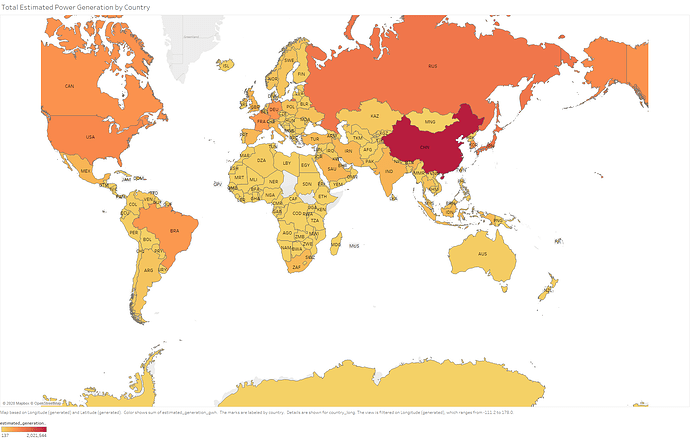
Visual Design Type: Choropleth Map
Name of tool: Tableau
Countries included: All countries included in the dataset with estimated generation data
Years: 2013-2017
Visual Mapping: Longditude, Latitude, Country (for labels and details), estimated generation (gwh) (shown with colour)
Unique Observation: Allows comparison of power generation by countries, more orange Countries are estimated to produce more power. i.e. China generates far more power than its neighbour Mongolia.
Data Preperation: Estimated generation of powerplants totalled for each country.
Source: http://datasets.wri.org/dataset/globalpowerplantdatabase
Question:
Is this Visual Design sufficiently clear?
Are there any improvements I could make to this design?

