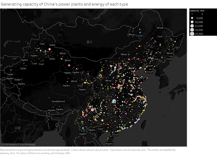
Data Set: http://datasets.wri.org/dataset/globalpowerplantdatabase
Visual Design Type: Map
Name of Tool: Tableau
Country: China
Years: 2014
Visual Mappings: Map shows the locations of all energy plants and the Type of energy in China.Different colors represent different power plant names. The size of each point represents the amount of energy the power plant can provide each year.
Unique Observations: Hydropower often generates large amounts of electricity, most of which are concentrated along the coast, near rivers and lakes, and below the map. To the north of the map are wind and coal. No solar power plant has been found in Tibet, where Tibet has the highest ultraviolet rays and the highest altitude.
Data Preparation:
- Countries are filtered to only include China.
- The colors are edited to uniquely represent each power plant.
- The size is edited as power generation capacity
Question:
Whether such a scheme can correctly display the data and can give a general description of China’s energy output. Looking forward to better suggestions.
Thanks very much for taking the time to look at my graph!

